I've posted previously about how there was an idea in the early 90s of DIY culture. This manifested in many ways from 'crusty squatters' and indi-networks through to self publishing and a revival of the punk aesthetic and the 'zine. This post is about the later. Head Magazine was published by a small group of loosely associated people. Each issue was driven by one of them and whoever they could persuade to help them to produce it. This meant it had no strict identity as a magazine, with each issue being an unique artefact published at random intervals. Often contributors would appear across many issues but the subjects would be diverse, as each issue had a 'theme' associated with it. The issue shown above is No. 6 The Ambient Fishy Issue. The main themes were ambient music, noise, technology, conspiracy and paranoia. All sprinkled with a generous helping of mildly left wing politics and some tongue-in-cheek humour.
The magazine operated a very 'open' editorial policy, pretty much everything that was sent in made it to the issue, as long as it aligned with the theme. Content standard varies a lot but that was very much part of the ethos - sod the established ideas on what 'quality' is and let everyone have a go. As you may have guessed there was more than the odd aging punk involved. This is one of the key differences from the indi and self publishing scene of today. Today quality matters - a lot. Today, small independent magazines are surviving and thriving thanks to that focus on quality, both in terms of content and production. Access to cheaper and better production technology has certainly helped this. I wish that the very excellent http://www.newspaperclub.com/ had been around back then.
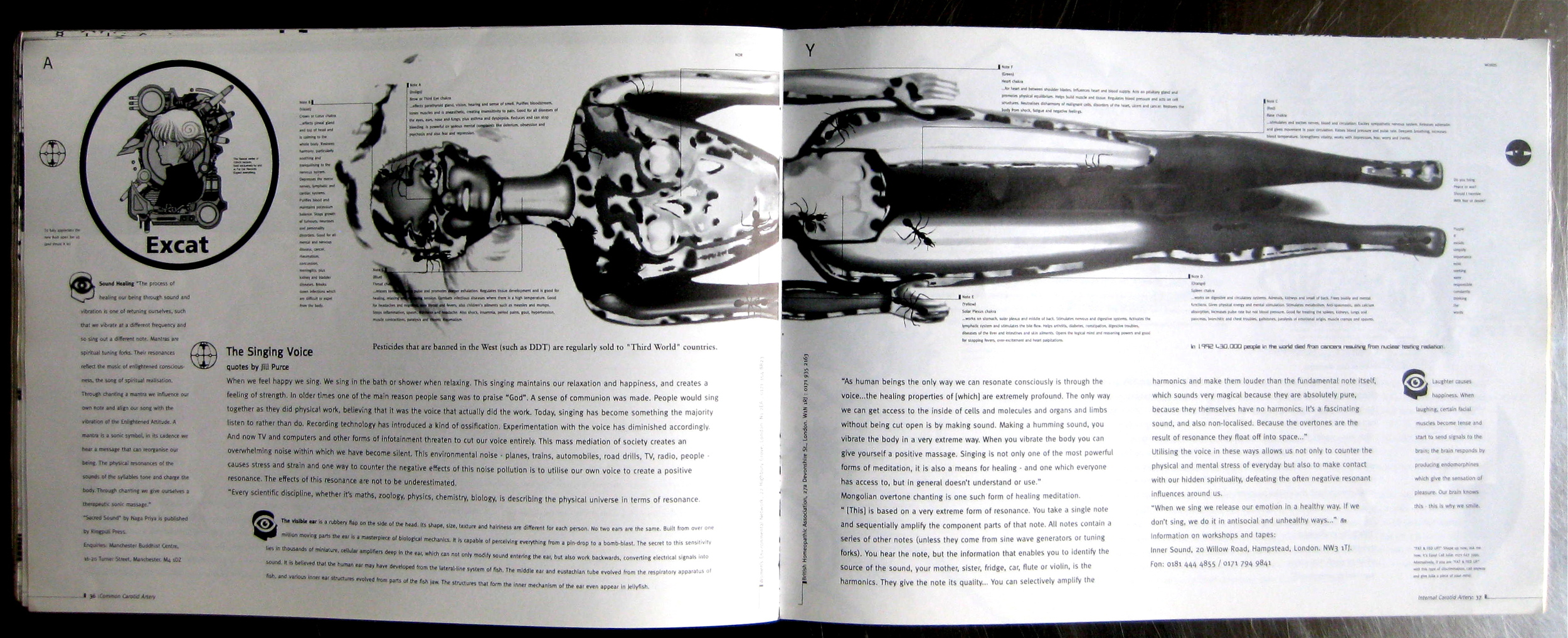
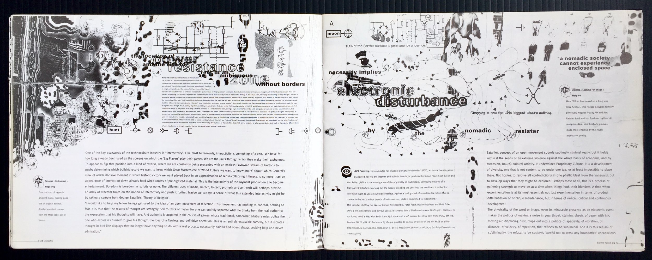
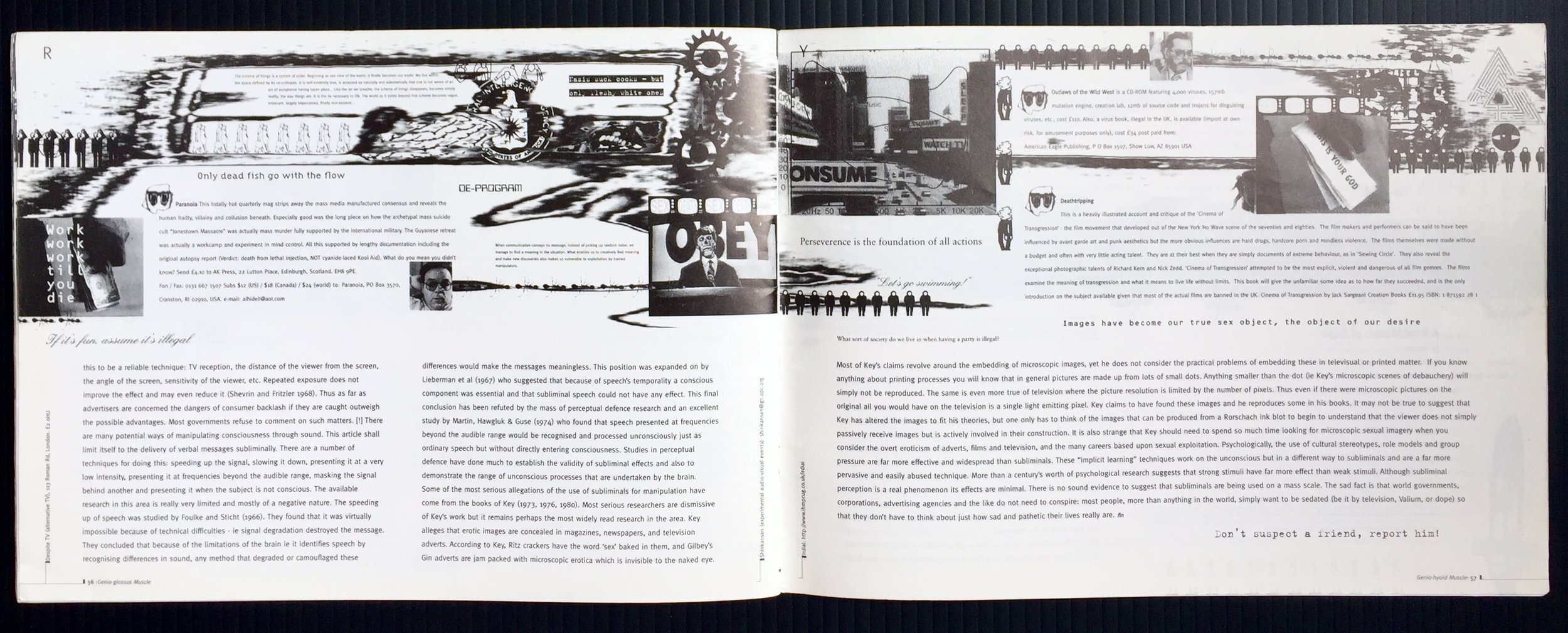
Colour printing was also a costly business, so single colour was the norm with most of the artwork created in bedrooms, then photocopied. This issue was a little different as it was put together on a PC (4mb of RAM) using Photoshop and QuarkExpress, and thanks to a few paid Ads it was printed and bound. The two creators; Mobile D-Unit and Faceless Networker laboured long and hard to get the chaotic, layered, dense and noisy layouts that feature throughout the mag. The imagery for each page was created as single page TIF files in Photoshop 2.5 (the days before layers and 99 levels of undo) using 'magic wand selections' and 'paste inside'. The images were shared back and forth, mainly by personal delivery of a 'zip disk', with each person adding their own touches, tweaks and layers. The main body copy was laid out over the top and fitted appropriately, if the fit wasn't right the image was changed. This took a lot of patience, effort and was prone to mistakes.
The issue is full of patterns, codes, repeat gags and deliberately bad type. The content is a continuous stream of visual noise flowing from spread to spread. You have to work hard to stay on track when reading an article as the design and the other content is always attempting to disrupt the flow. This is especially apparent when you discover an interesting nugget hidden away in the noise, finding your way back is not easy.
It's in no way a great piece of print design rather a signature of a time, place and attitude. It featured along with many other similar pieces in the Barbican's Jam: Style+Music+Media exhibition circa: 1996. This type of mag is long gone and has been replaced by a lively and growing community of self publishers and indi press. They are using digital and web based publishing technologies to create wonderfully rich and engaging pieces, often by blending them with hand printing and traditional print techniques. It's a great time to create a magazine. Yet still they scream "print is dead" as they did back in the '90s and every 10 years since. Must be on at least it's 4th resurrection by now - difficult to kill off something thats been with us 550 years.
Update
I decided that I should add all the spreads from Head 6, so here you go


