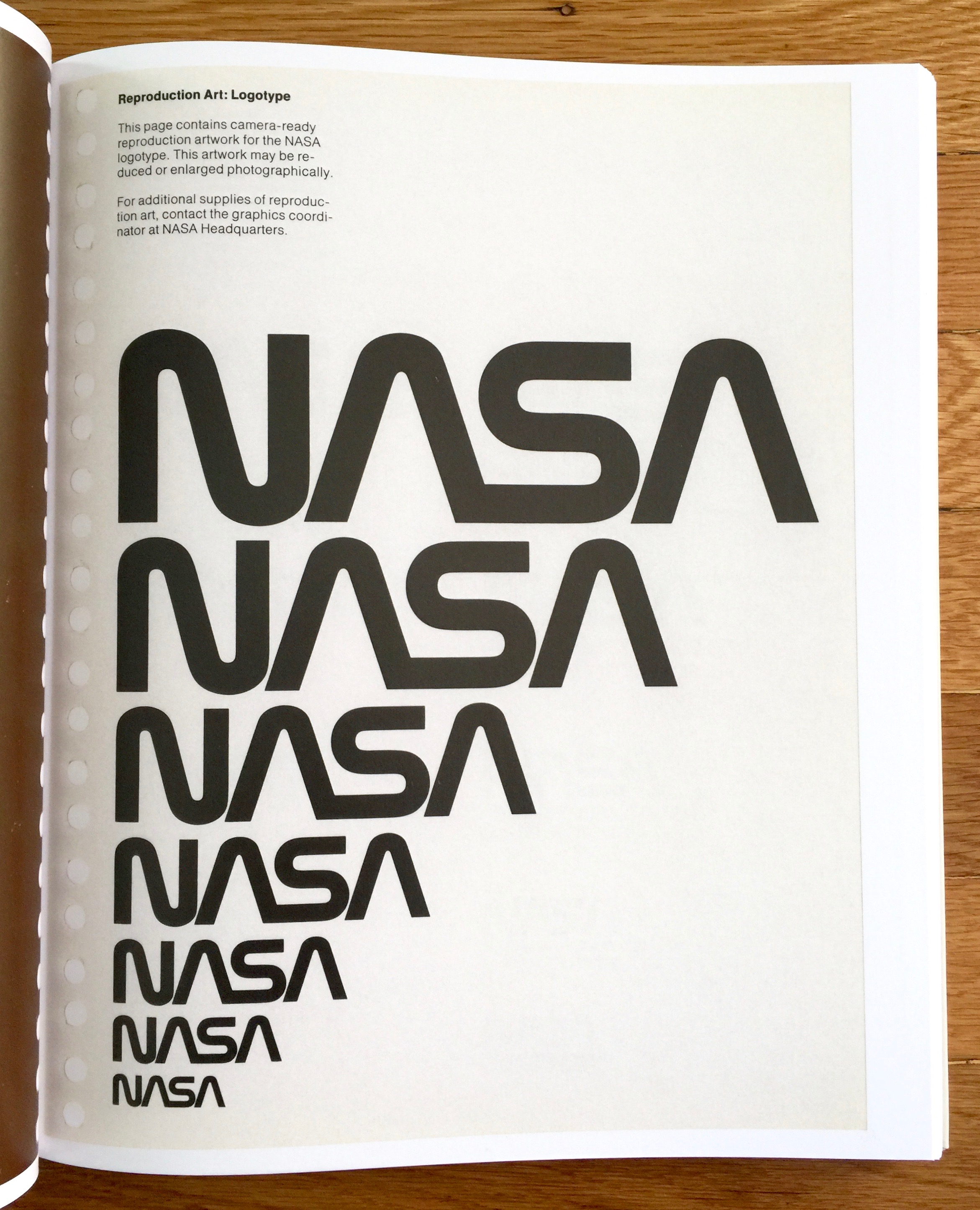
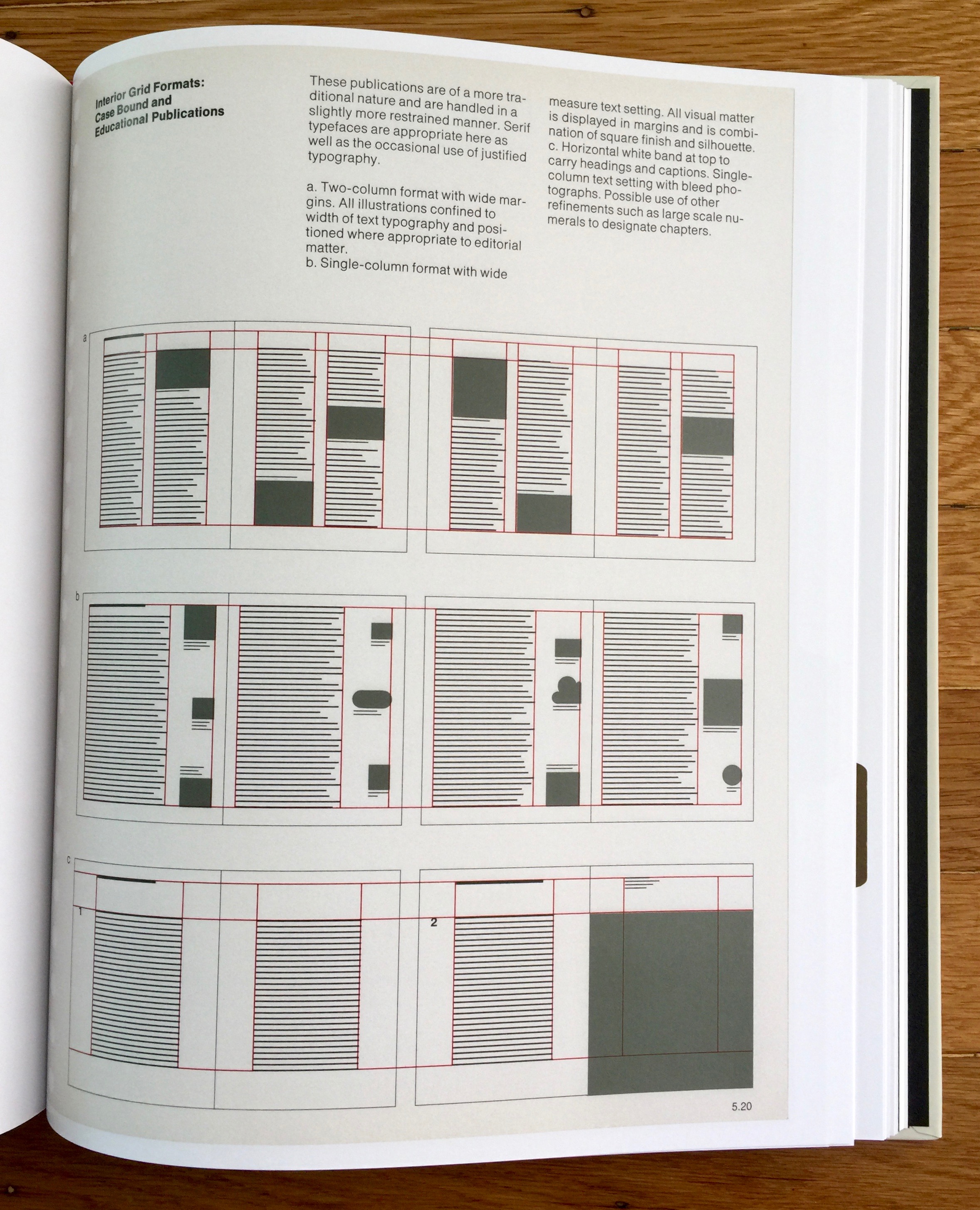
This is a graphic design and 80's child, double hitter. Nasa was so cool growing up (even in the UK). I think it was mostly due to the Space Shuttle with a little help from Moonraker. This reissue of the Nasa Graphic Standards Manual (Danne & Blackburn) from 1974, marks the identity change from 'meatball' to 'worm'. It's bound as a book and wrapped in a 'space aged' reflective foil envelope. The original was presented in a ring binder with hole punched pages, and it's those pages that have been scanned (including the holes) and used in the book. The reissue design team (Jesse Reed and Hamish Smyth) have reproduced all the fold out pages to create an accurate and loving (but bookshelvable) version.
For me the Nasa identity is something that screams space! Much more than Star Wars or Star Trek ever did because Nasa was (is) real, making the impossible possible and the bringing the unimaginable that bit closer. The style of the 'worm' mark firmly places it historically in the 70's/80's but somehow remains a timeless expression of space age design. I love the collapsed leading and condensed tracking on the full name National Aeronautics and Space Administration. As you'd expect the manual covers logo use, typography and colour as well as grids and layouts. But the really cool parts are the vehicle decal examples - it's not often that you get to show an example of your logo on a satellite and a Space Shuttle.
This is the first reissued standards manual I've picked up, but there's quite a trend for them at the moment. I think this is partly because they are beautiful objects that reflect the discipline and skills of pre digital graphic design, and partly because it's way more acceptable to be this geeky these days.
Grab a copy from the website https://standardsmanual.com/
For more standards and guidelines take a look at the marvellous United Editions imprint from Tony Brook and Adrian Shaughnessy https://uniteditions.com/


