So it’s been a long time since I posted, and have a backlog for sure, but I had to get these up.
I recently picked up two books from Atelier Éditions and they are such beautifully crafted books. They both look amazing but not only that, they feel incredible too. The paper and binding choices both enhance the overall design and elevate the books as objects you want to hold, peruse and love. Fabulous design from Capucine Labarthe for both of them.
First up: International Signal Code Alphabet by Corita Kent.
I have a few Corita Kent books and have seen a few of her pieces in real life. The biggest challenges are getting across the vibrancy of the colours and the feeling of the screen printing in a book. But this book does an incredible job. Every piece sings. Here’s a bunch of pics that in no way do it justice - get yourself a copy from their site or the Corita Art Center
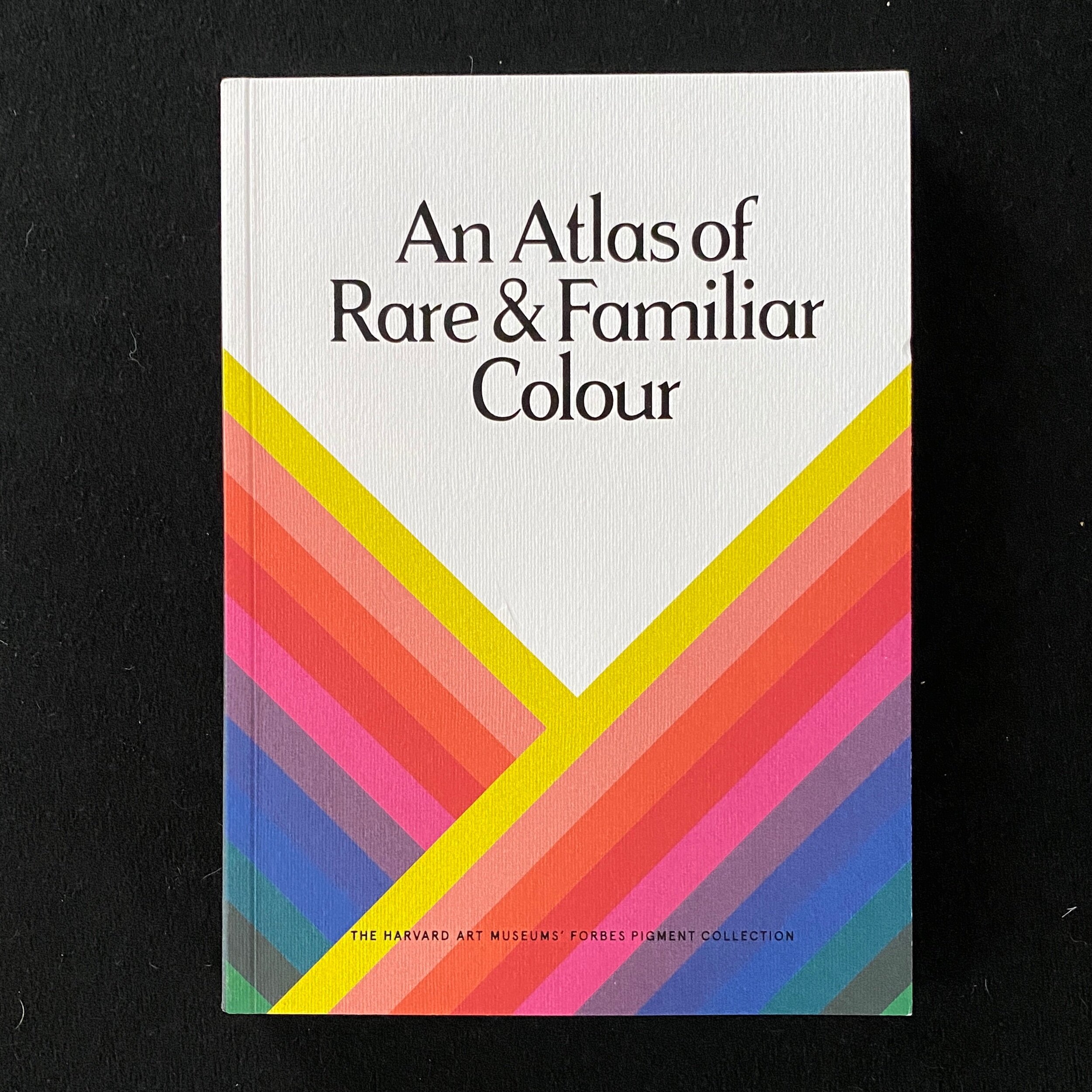
Next up: An Atlas of Rare and Familiar Colour from The Harvard Art Museums’ Forbes Pigment Collection
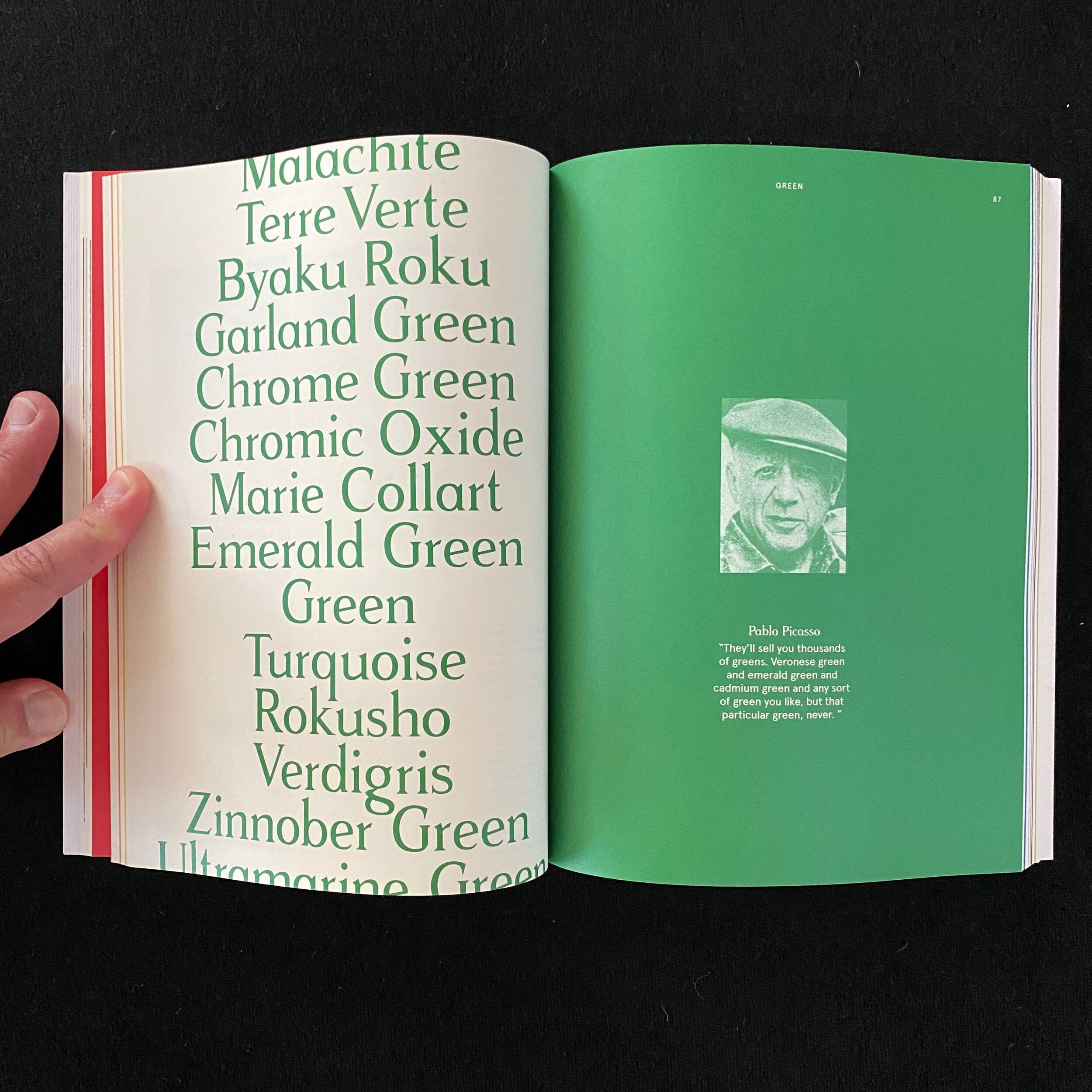
This small, beautiful book is super eccentric and definitely is now in my top three books on colour. It’s a wonderful visual journey through the raw pigment collection, the minerals and powders in jars, the rocks, and the very substance of colour. Each section is colour coded with beautiful section headers. Of course it has its challenges. It’s not exactly accessible as each section uses its colour for the text (against the paper) so the yellow, white and metallic sections are very challenging to read. But I’m willing to take that as more of an expression of the nature of those colours than a failure.
The book and stock feels wonderful and the artist vignettes for each colour are lovely.
Here are a few pics.


