It's taken me a while to post this and I know a few people have been eager to see the contents, so here it is:
『時間のヒダ、空間のシワ … [時間地図]の試み:杉浦康平ダイアグラムコレクション』
or
Experiments in "Time Distance Map": Diagram Collection by Kohei Sugiura
I saw this on the brilliant Instagram account: Collectible from HongKong (a must for any lovers of rare and interesting design books). And even though my Japanese is non existent I couldn't resist its blend of amazing data visualisations and beautiful book design. Here's a few words from the Editor's site, Mariko Yokogi about the book:
"Kohei Sugiura, a Japanese graphic designer leading its industry since 1950s, has published the book compiling his diagram works so far since 1960s. I joined this book project as an editor in the chapter of his talking with Seigo Matsuoka, a Japanese prolific author and director, and in other featuring chapters as well. Many designers of the same period had focused on the visualization working in the commercial field. On the other hand, Sugiura chose the cultural field like a book design, public projects and so on as the stage of his design activity. He is also a pioneer of infographics design in Japan. You can see his design philosophy in many diagram works including "Time Distance Map" he named as a general term. About spaces, cities, people's lives and the world of classical literature, he has been showing graphically by handling a enormous amount of data for years. This book introduces them and also try to analyze them using the latest digital technique by young architect and creators. It is written in Japanese only but so much images are appeared in it, then you can enjoy his design and get to know the history or one of aspects on graphic design in Japan."
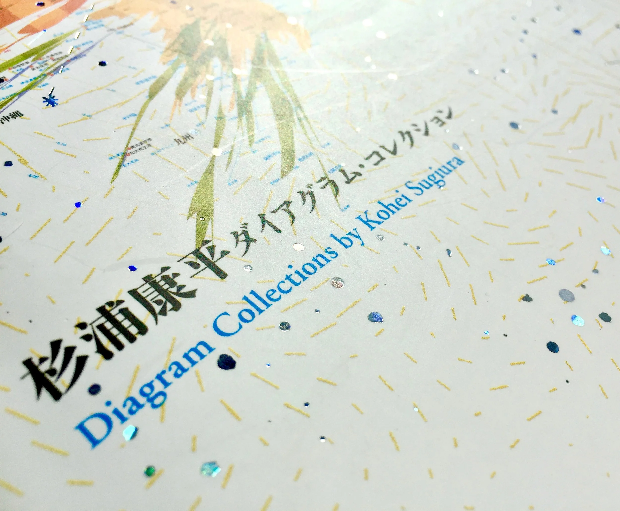
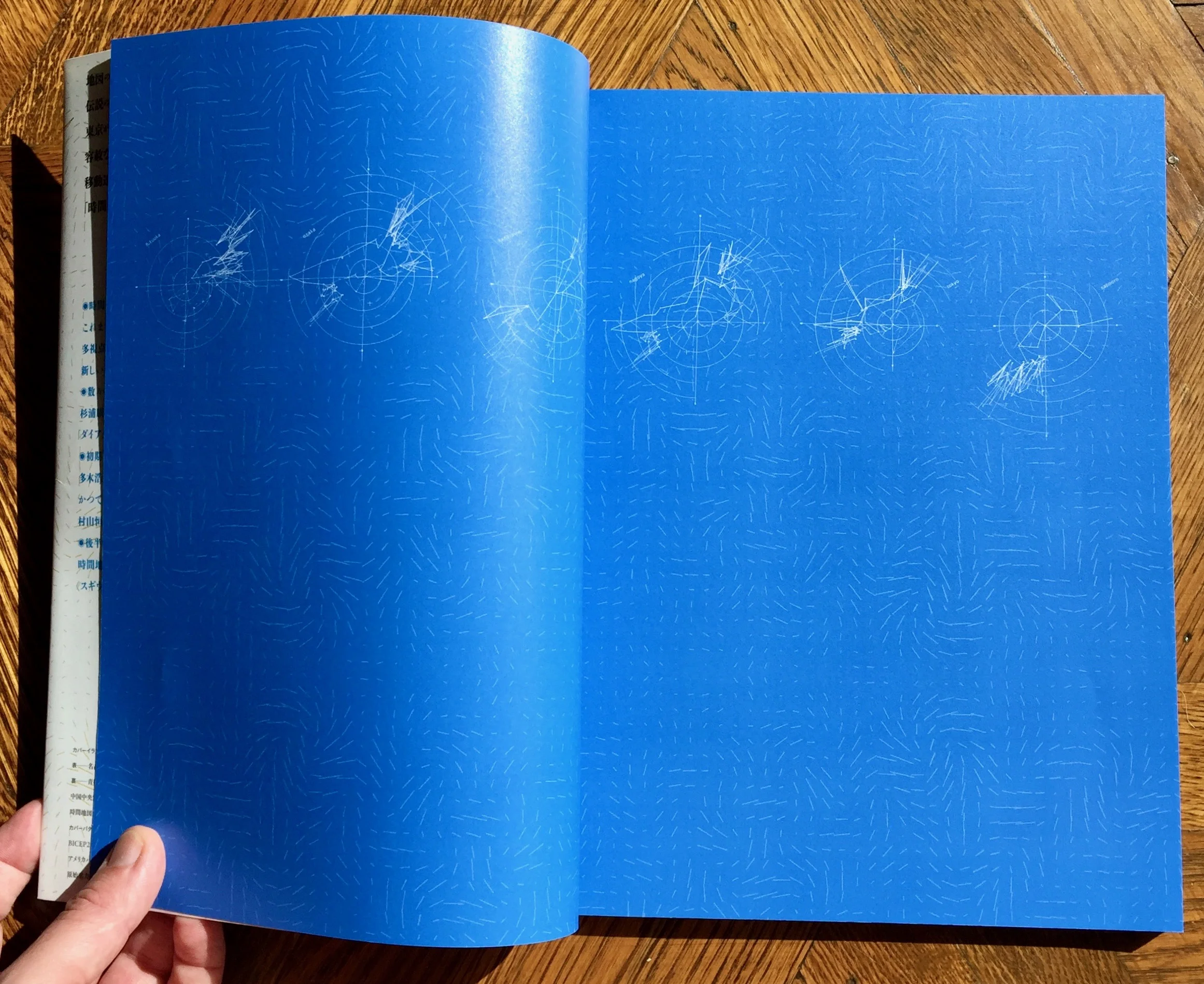
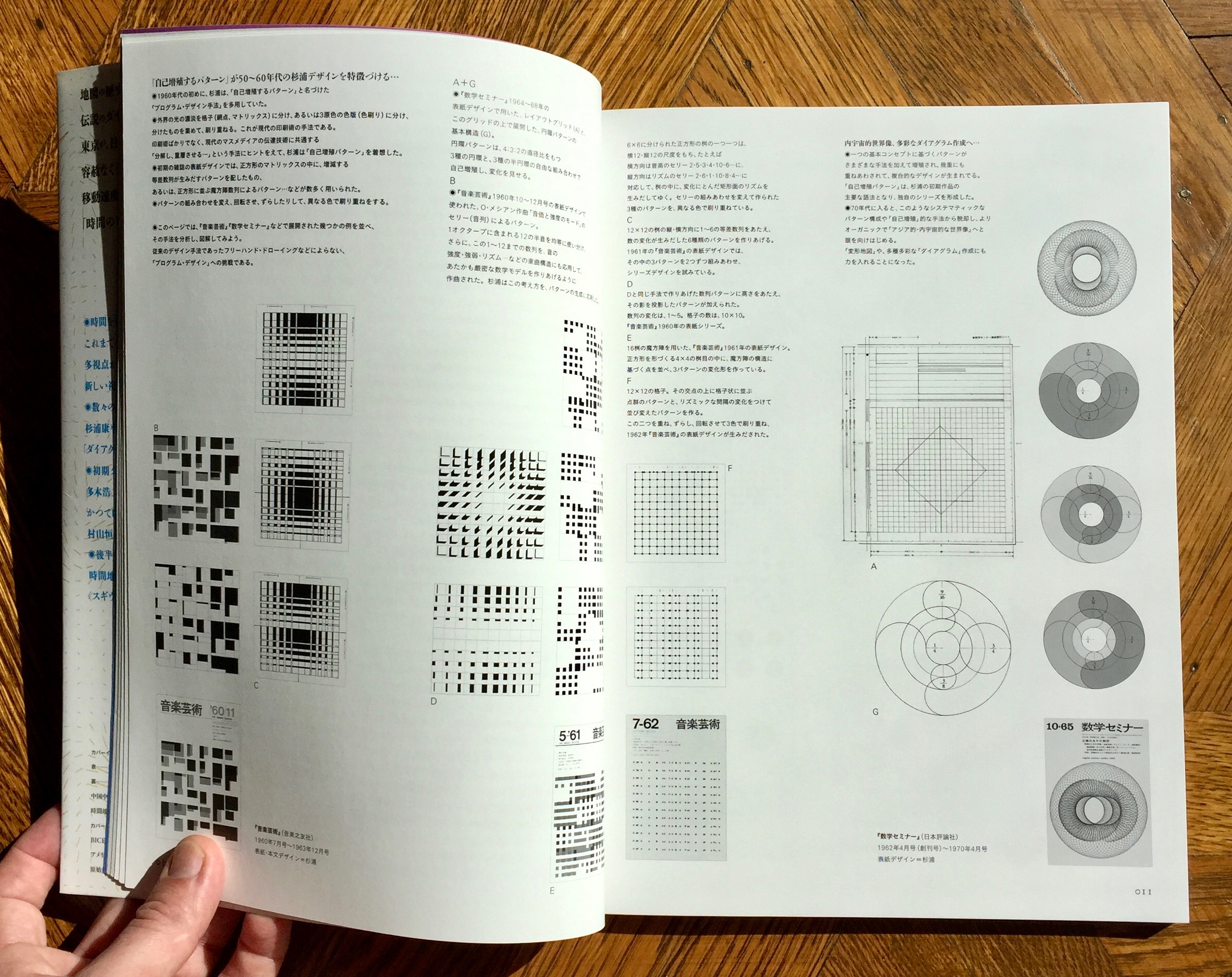
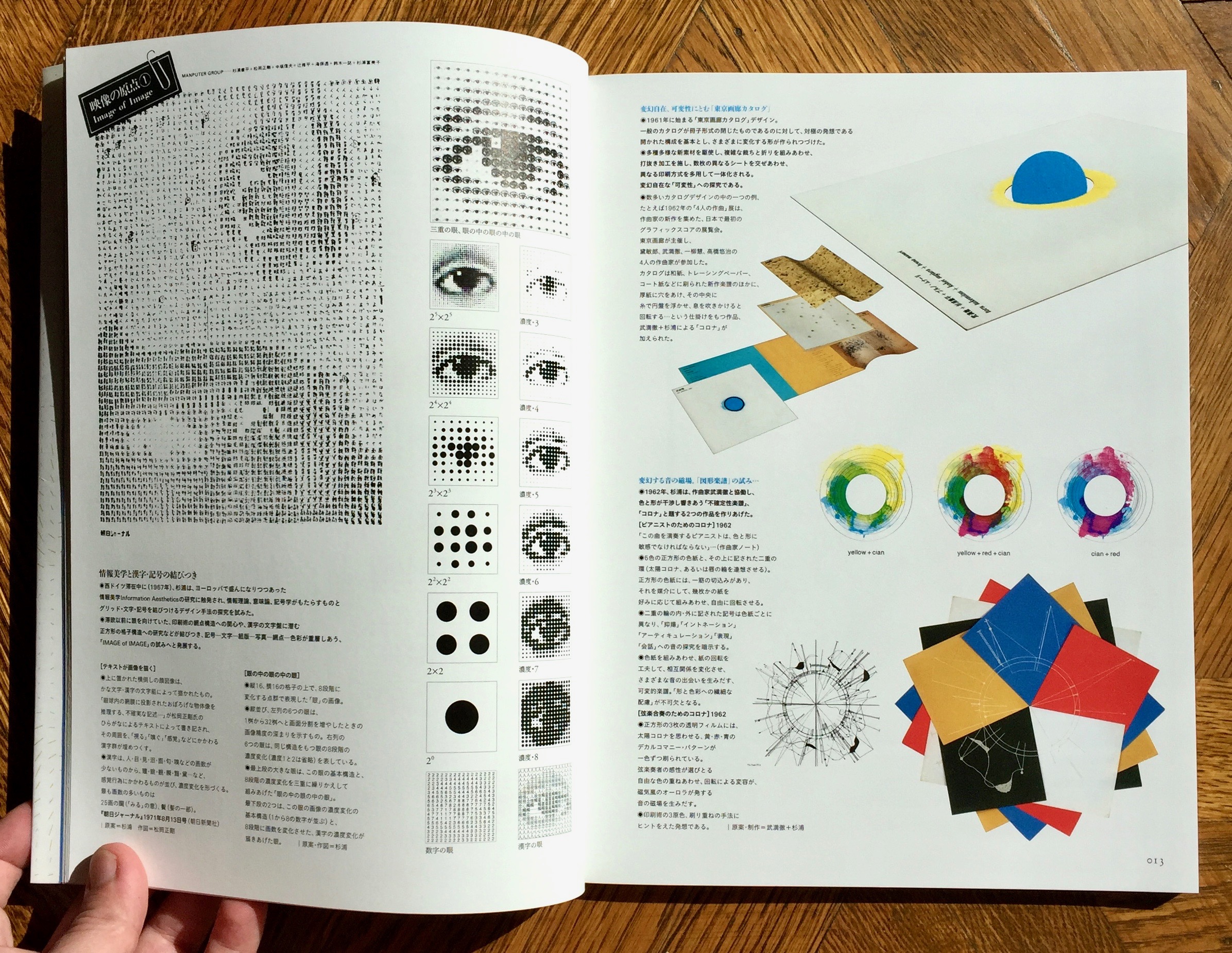
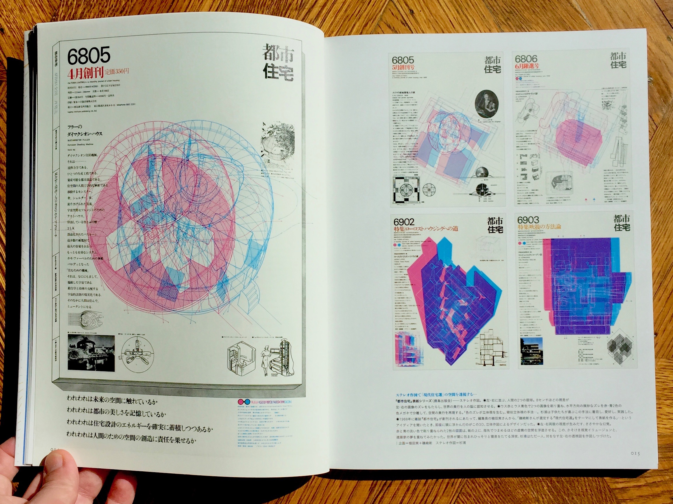
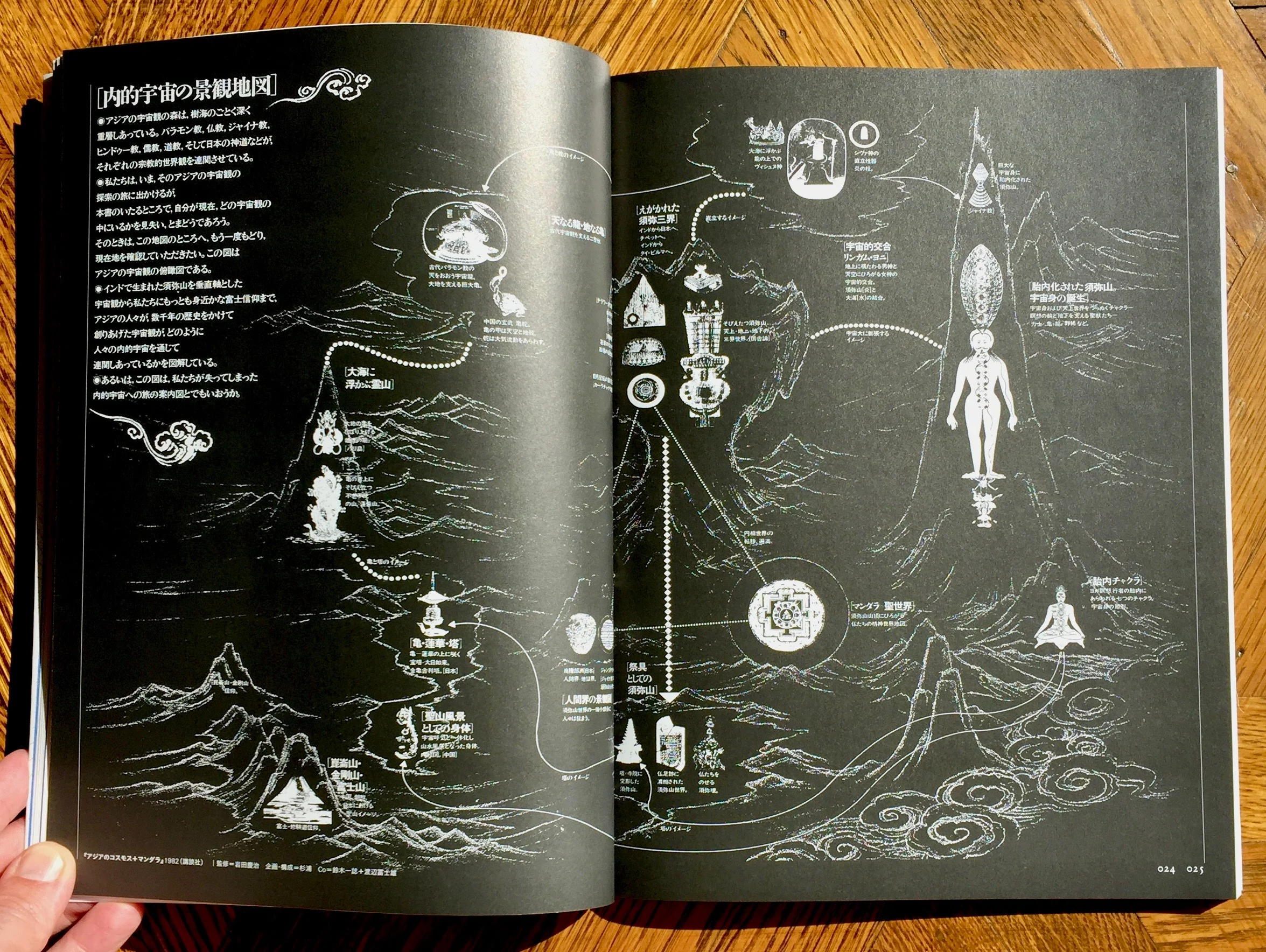
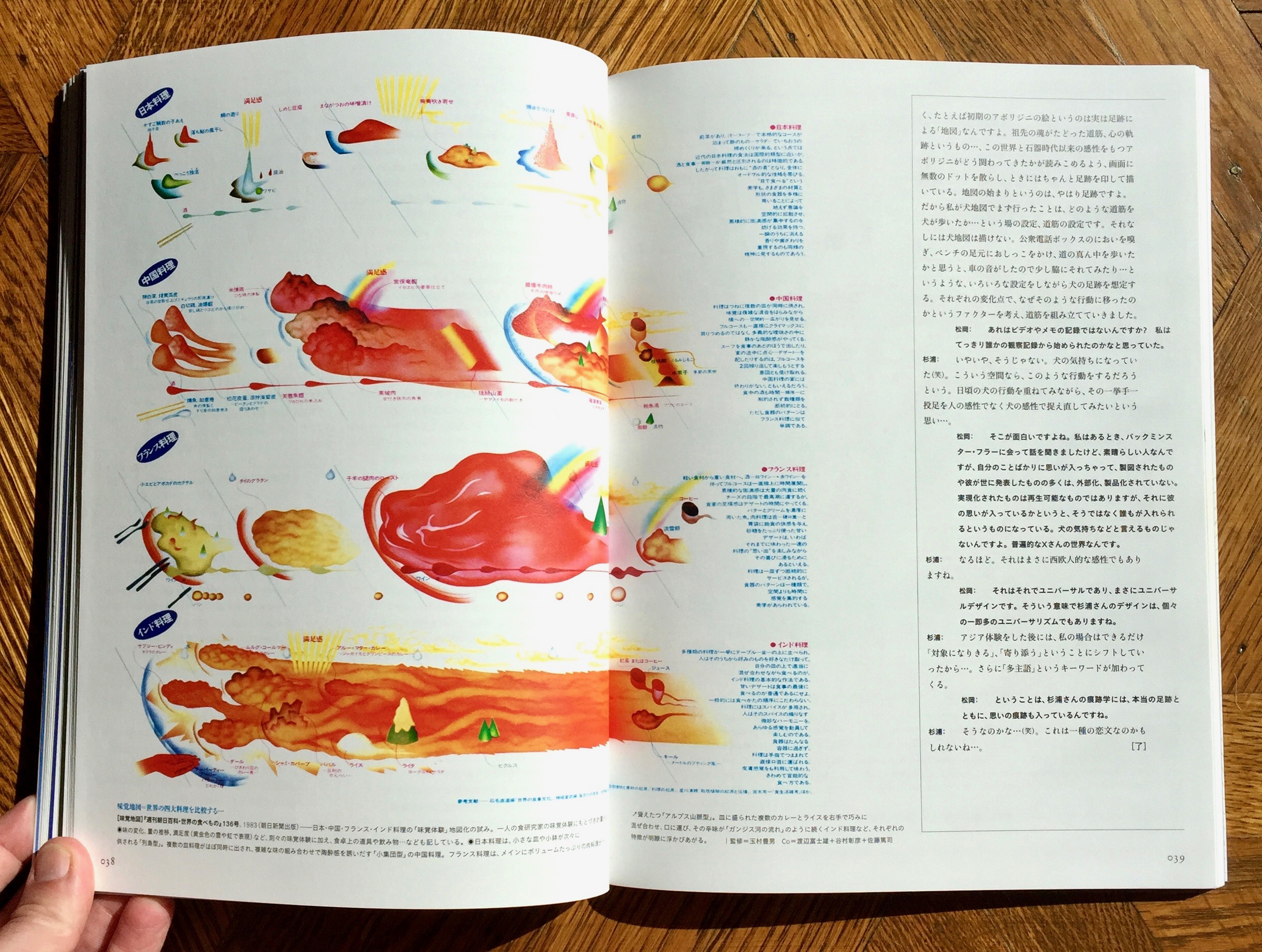
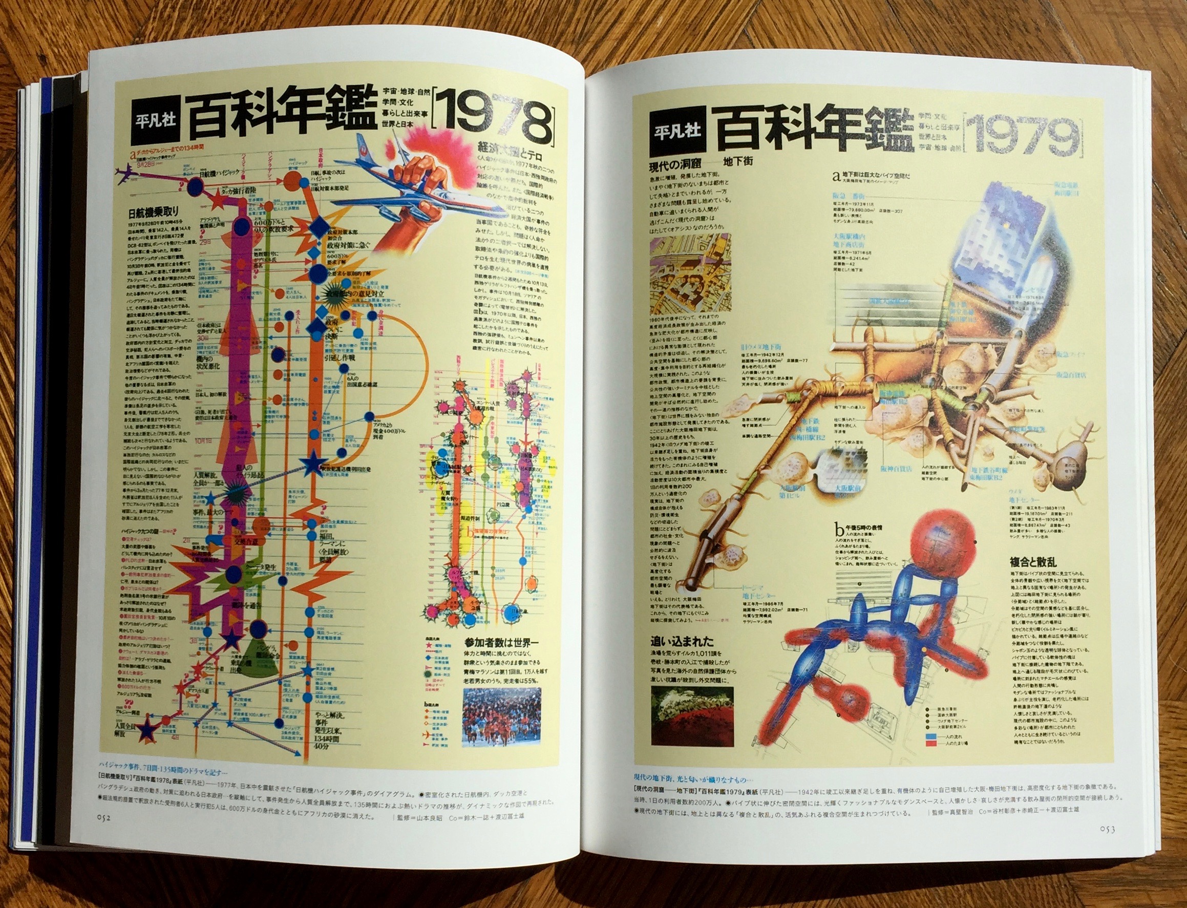
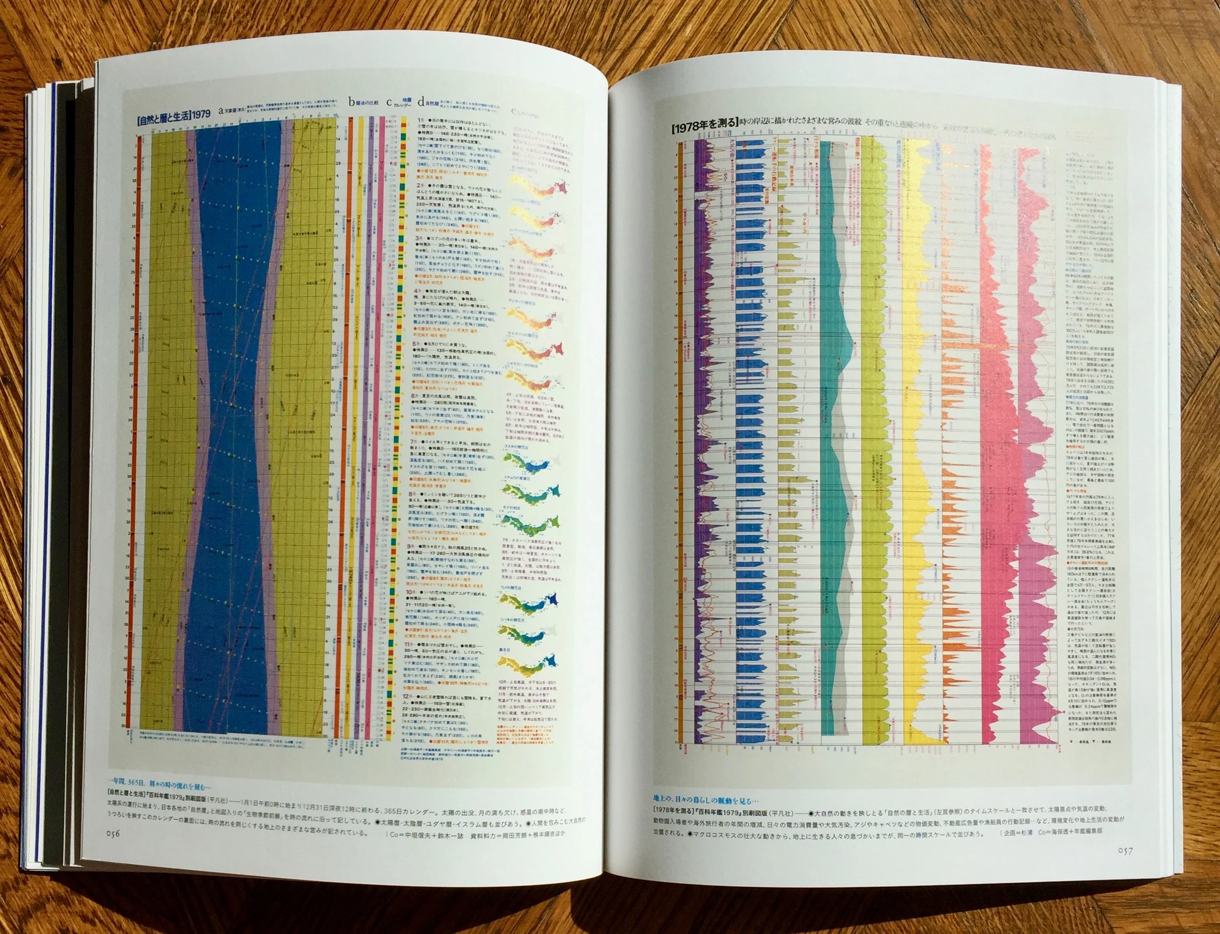
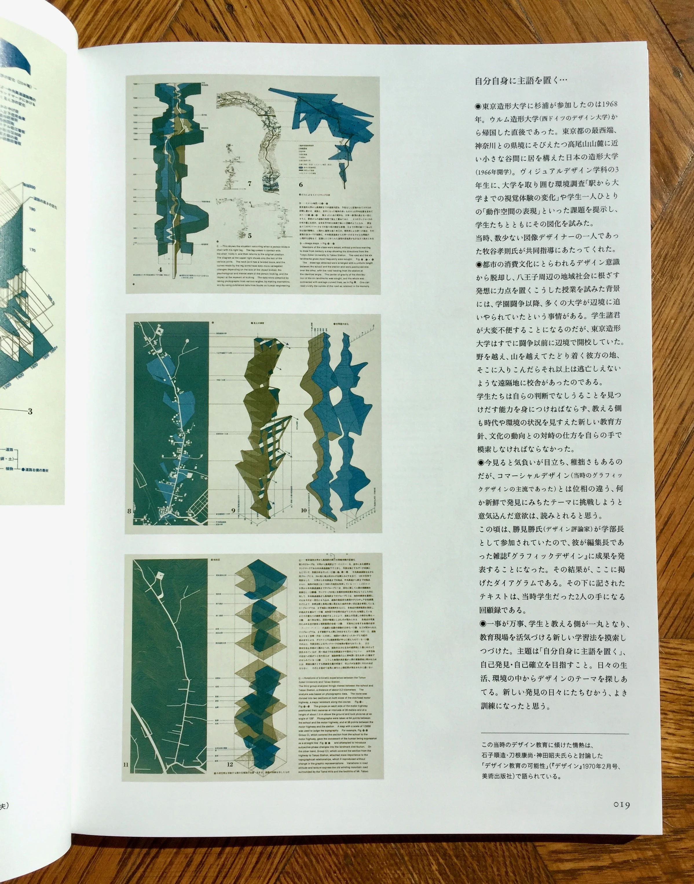
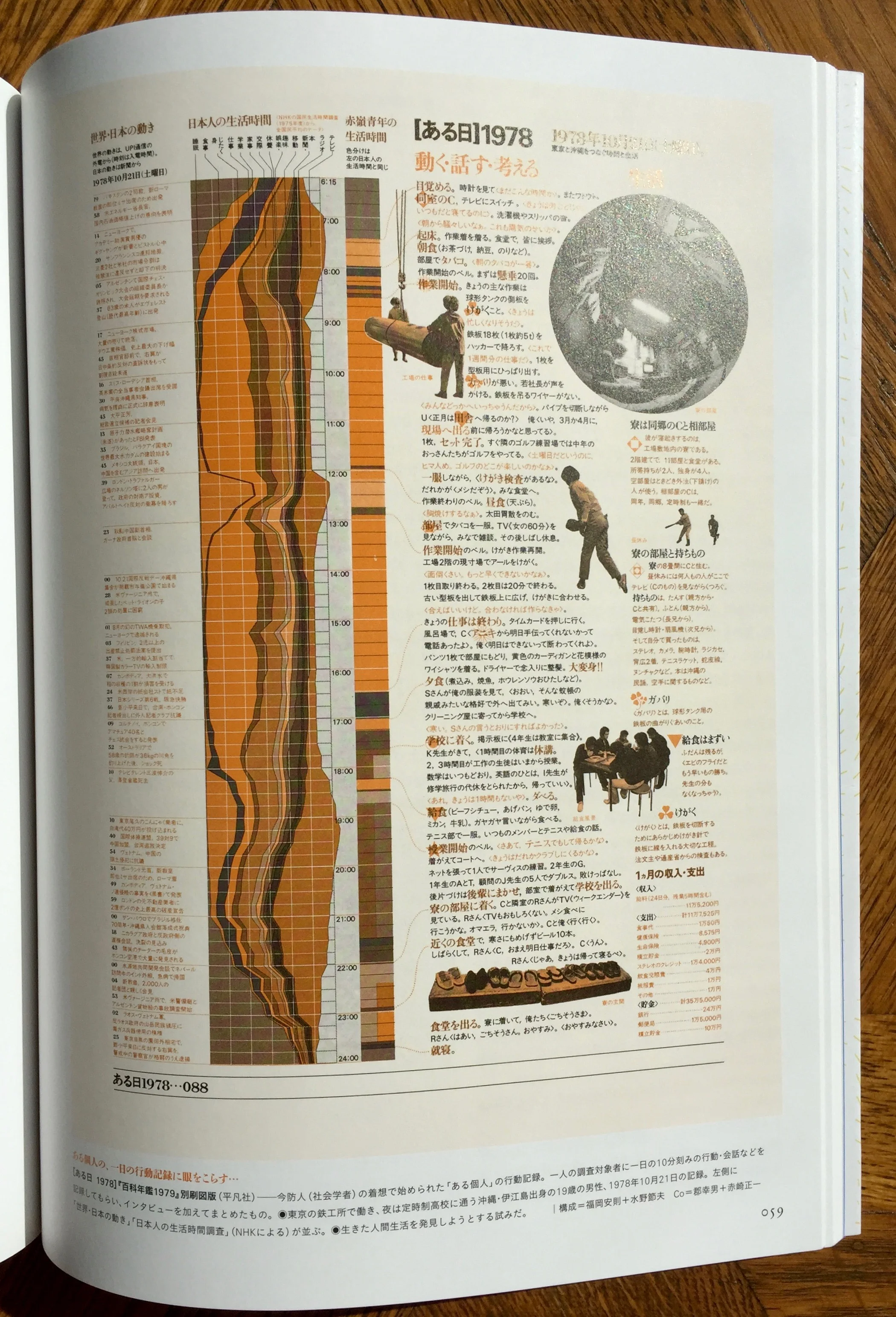
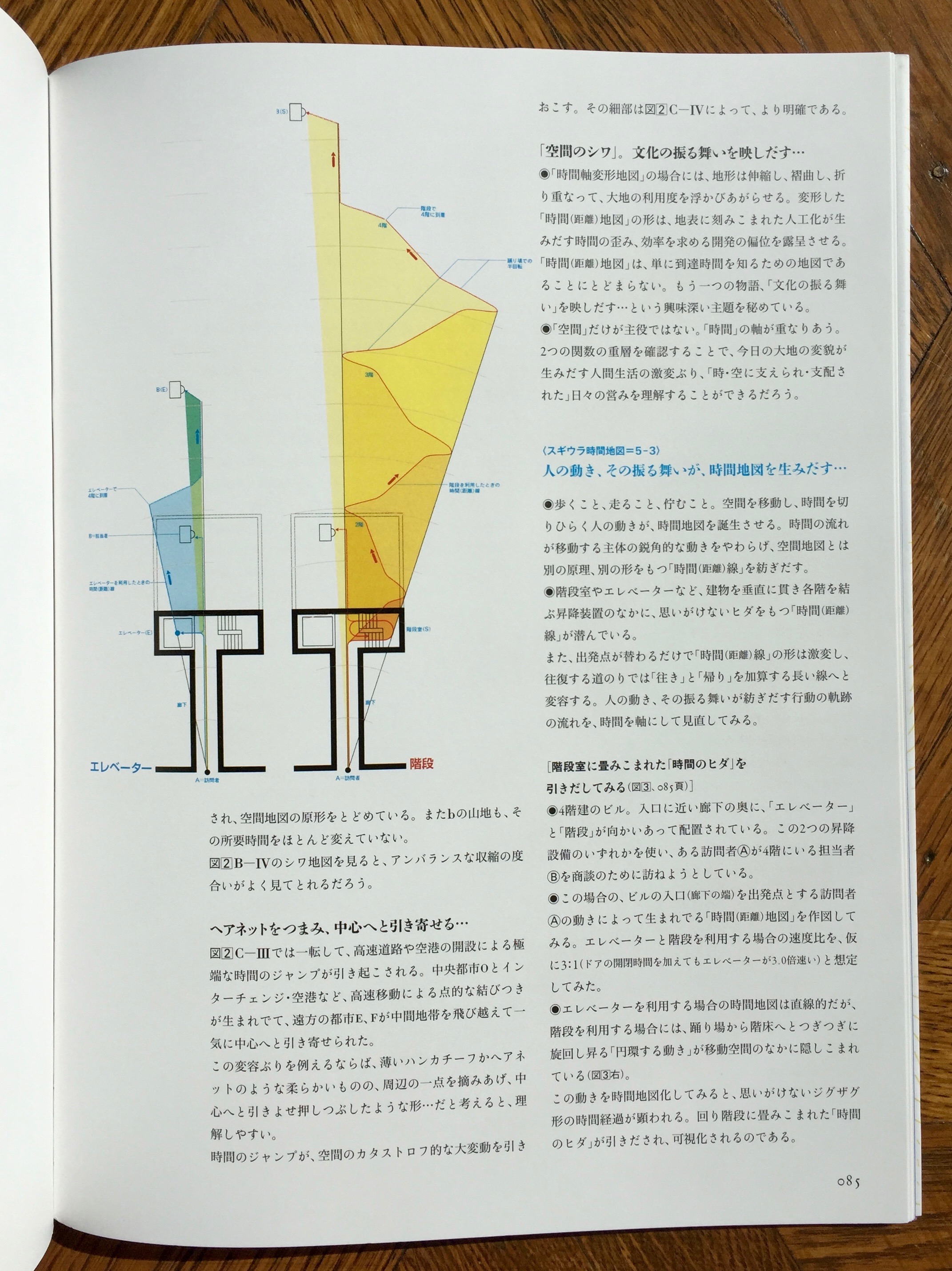
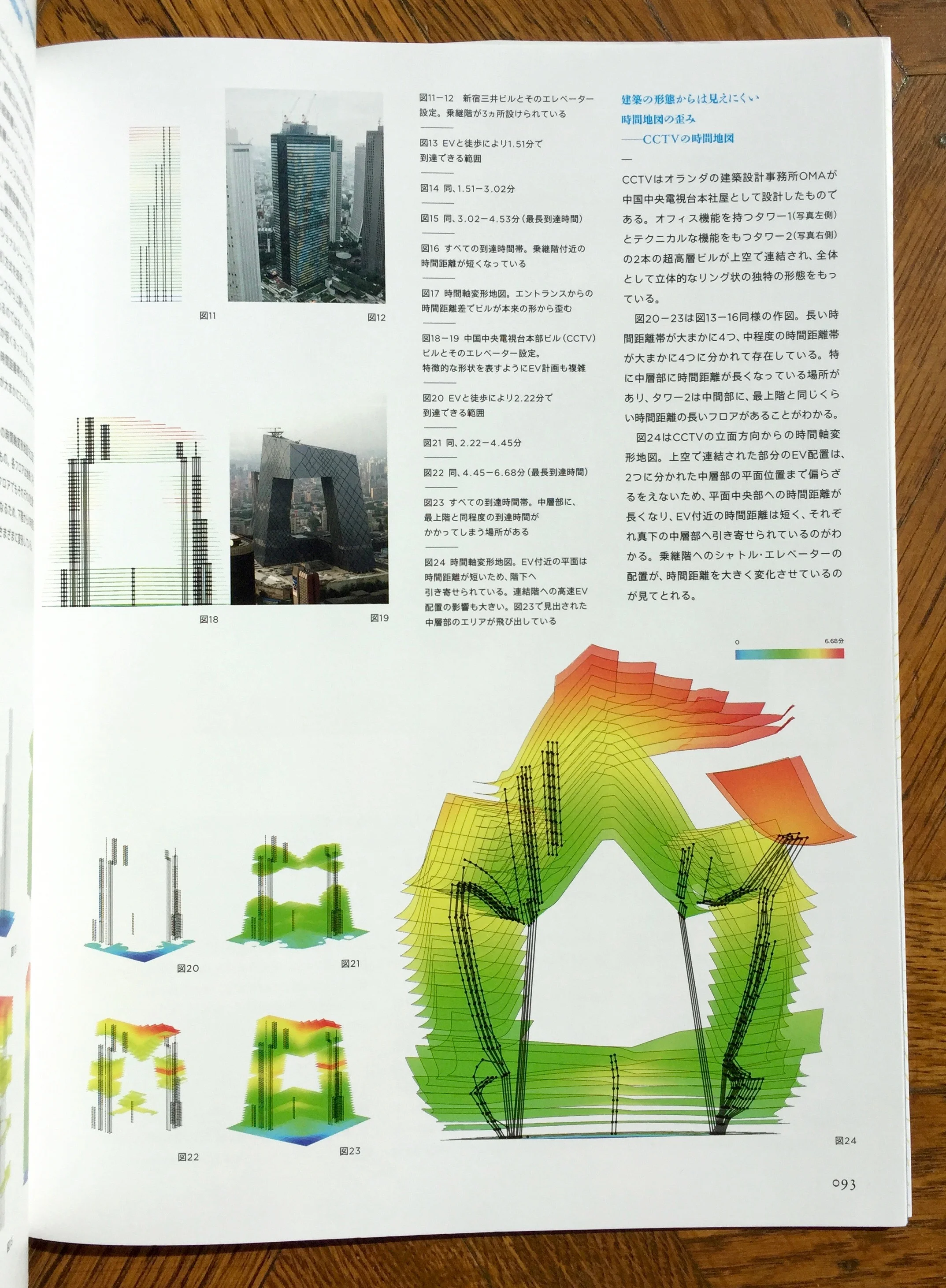
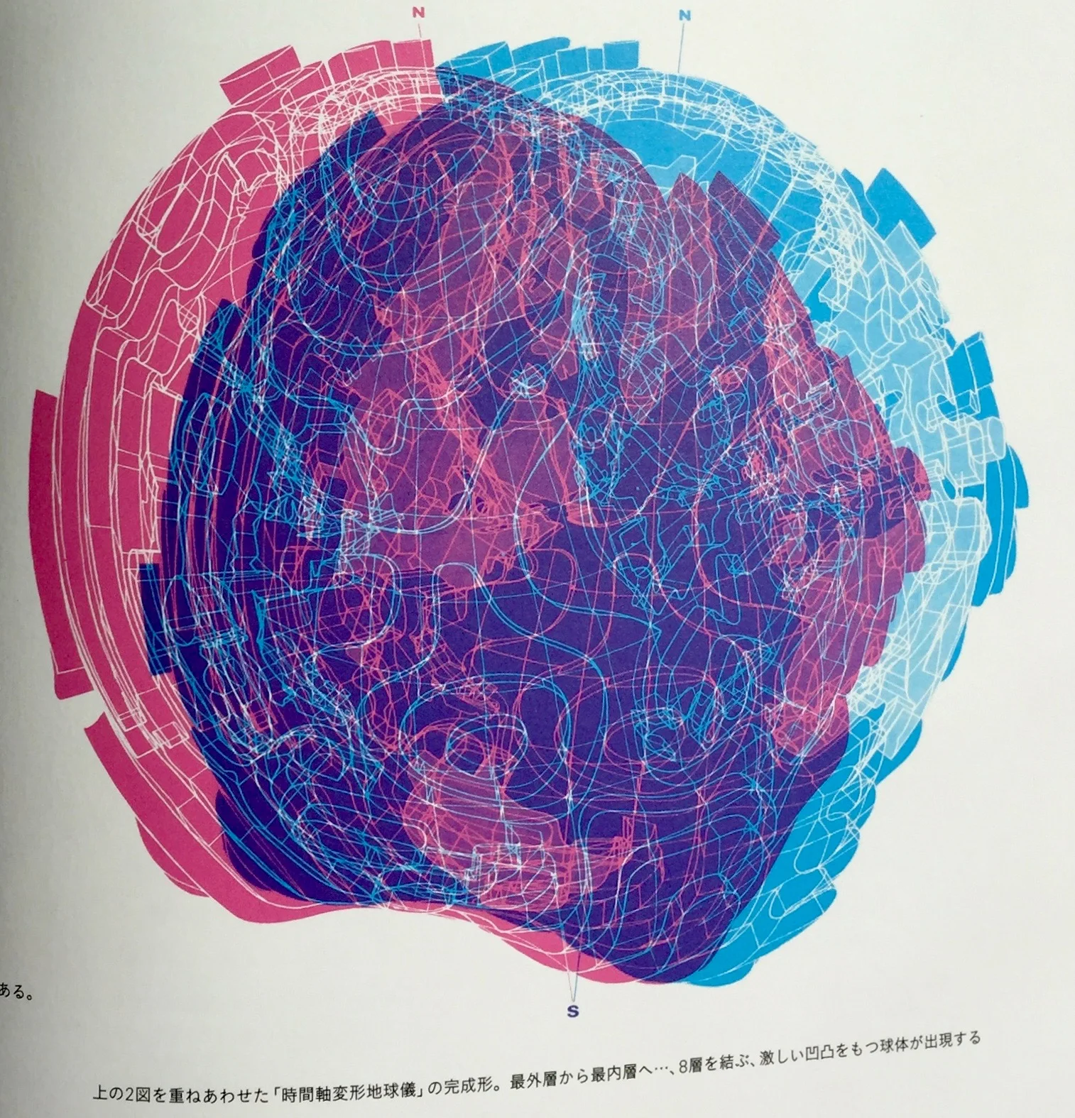
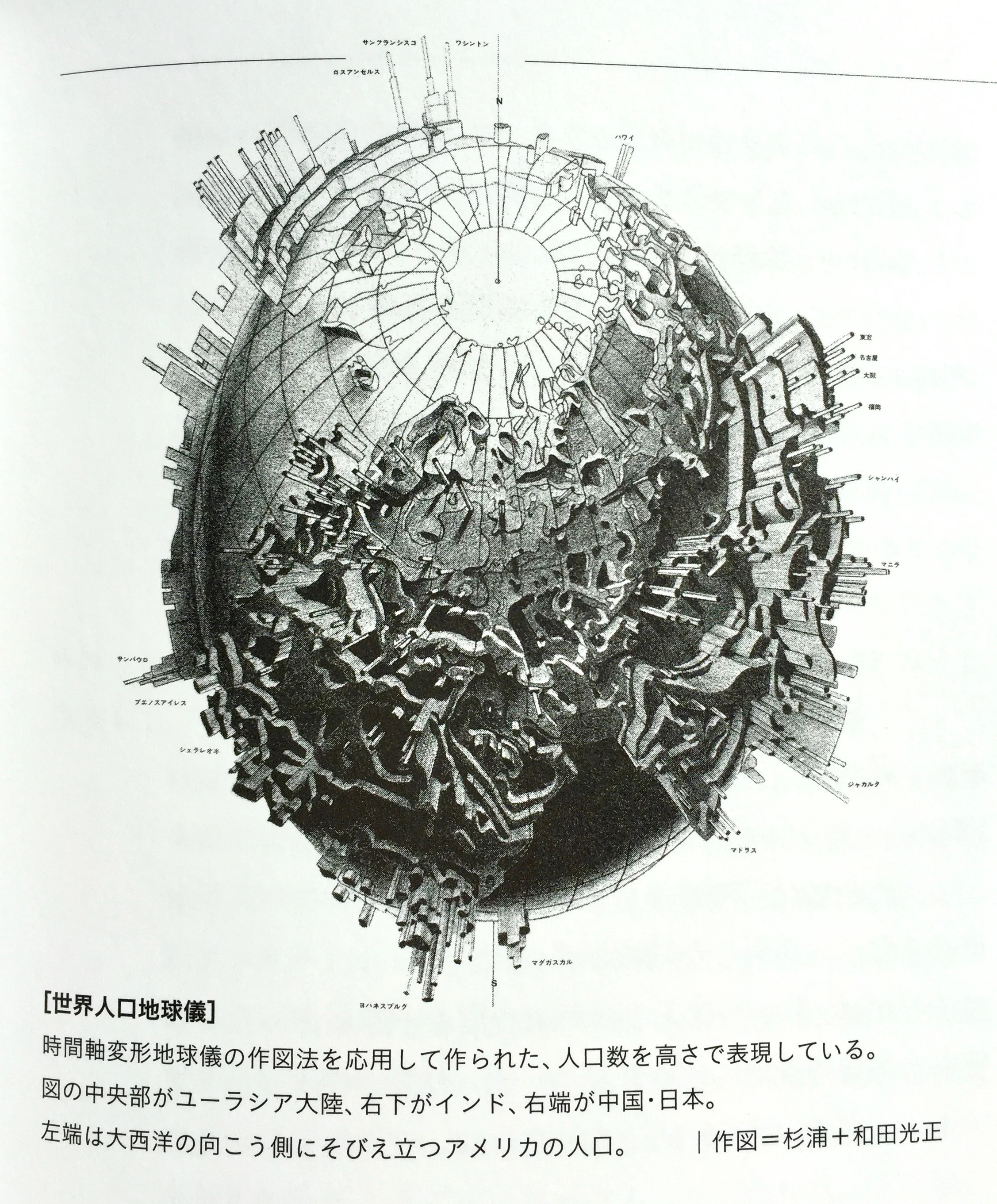
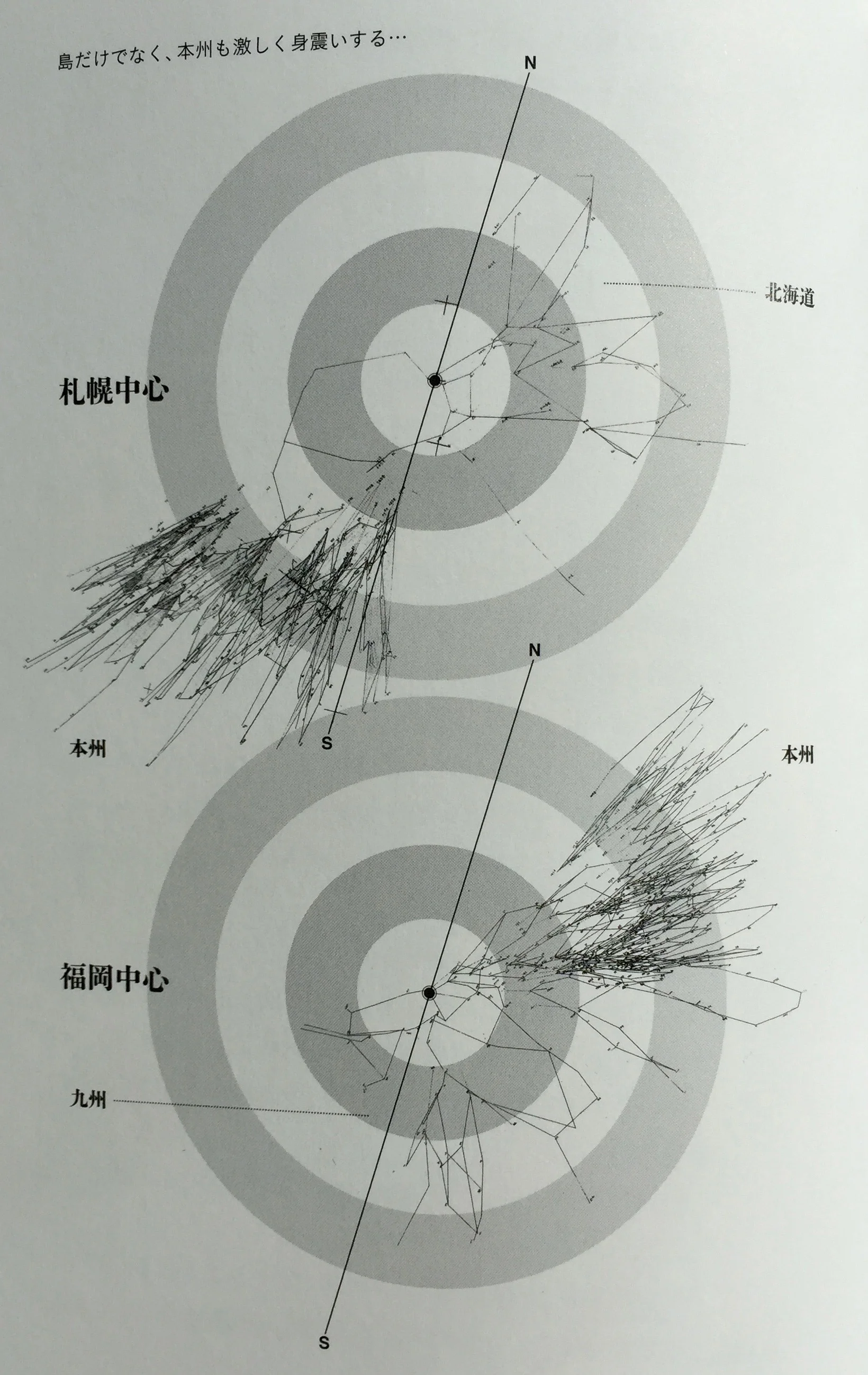
It's a wonderfully visually indulgent item. From the spot foil on the jacket (repeated underneath on the cover!) to the fold outs and end pages. Some of the visualisation work is truly amazing, utilizing 3D both diagrammatically and anaglyphic (for 3D glasses). Here are some of the spreads:
But it's the diverse approaches and details that really make the book stand out.
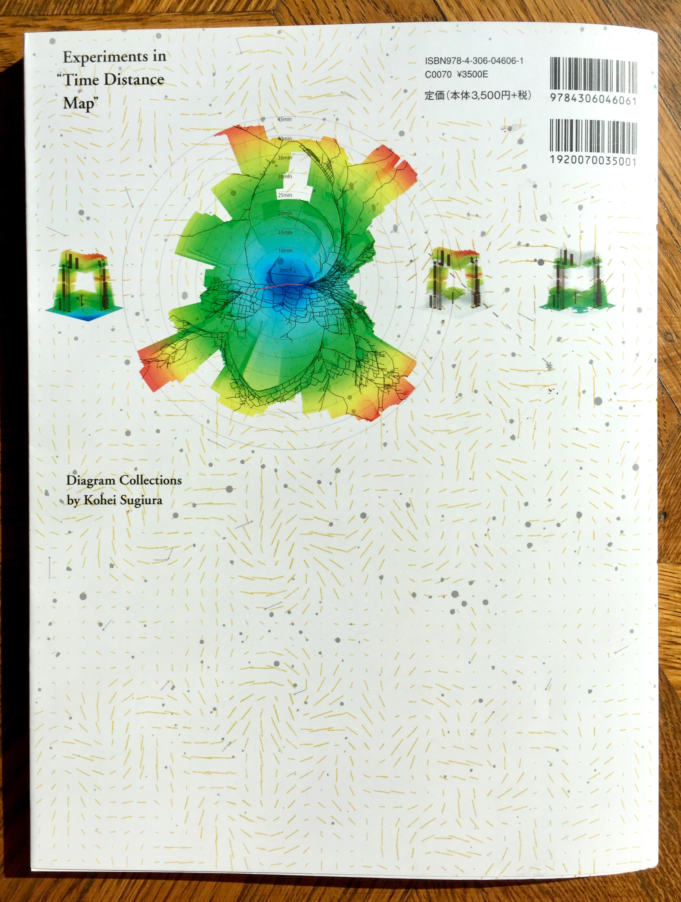
And then there are these two wonderful fold pieces. Firstly the projection based one featured on the cover.
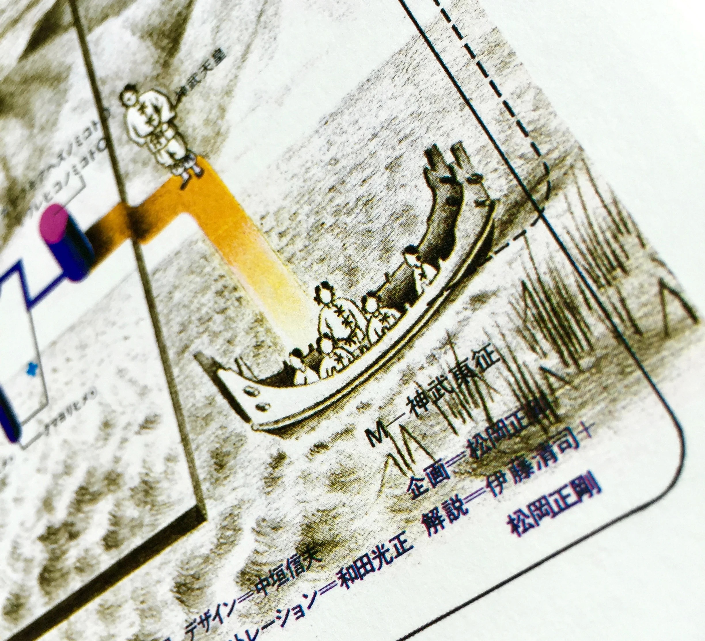
Then this incredible timeline. In fact it was too big for the fold out and continued overleaf for another spread.
It's an incredible look at a master practitioner's work exploring the visualisation of distance and time.
