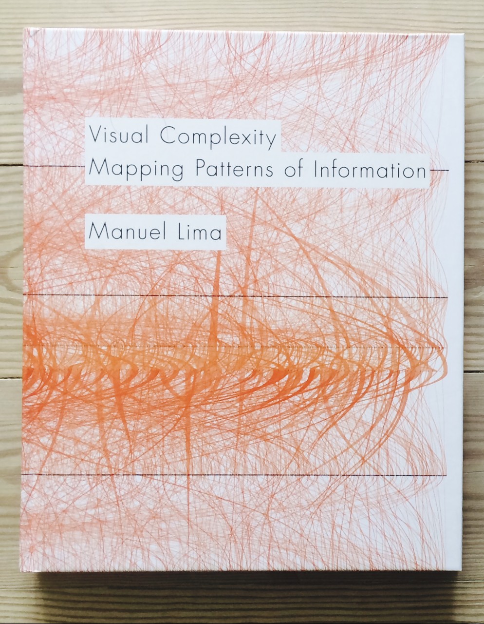
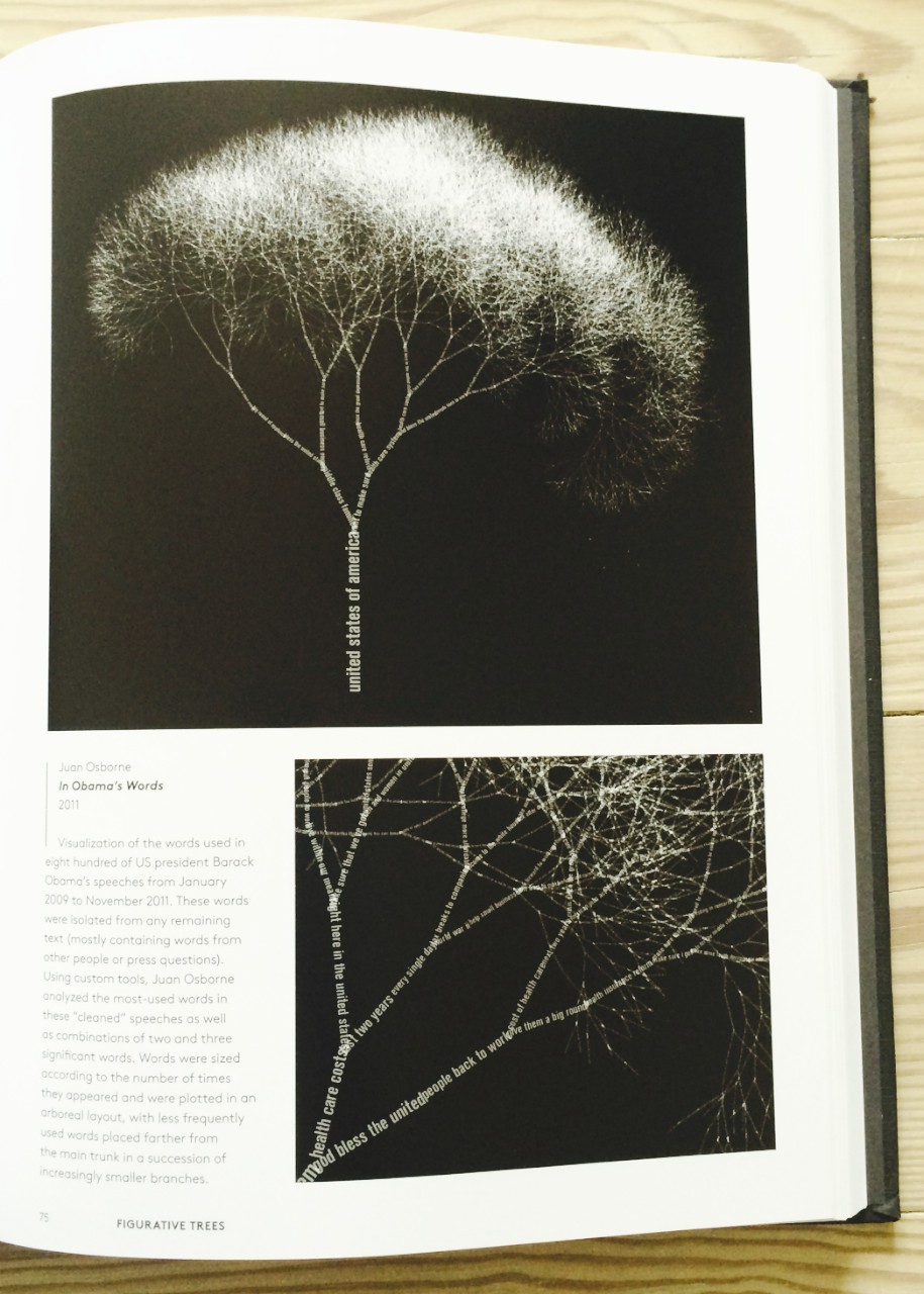
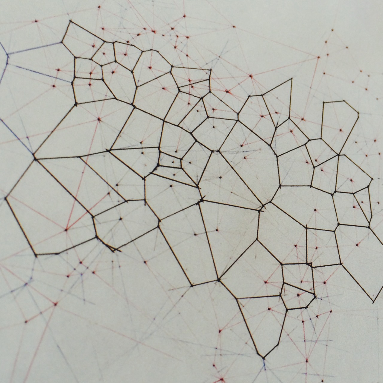
Continuing my two of kind theme, I've just received my copies of Visual Complexity and The Book of Trees both by Manuel Lima.
If you're a fan of Edward Tufte or just into information graphics and data visualisation, you'll love both of these. There's a little overlap but it's worth it. The most recent one (The Book of Trees ) is really wonderful. They are both from the excellent Princeton Architectural Press, whose publications I've raved about many times on this blog. They published the incredible Cartographies of Time, which is a book that I can pick up again and again.
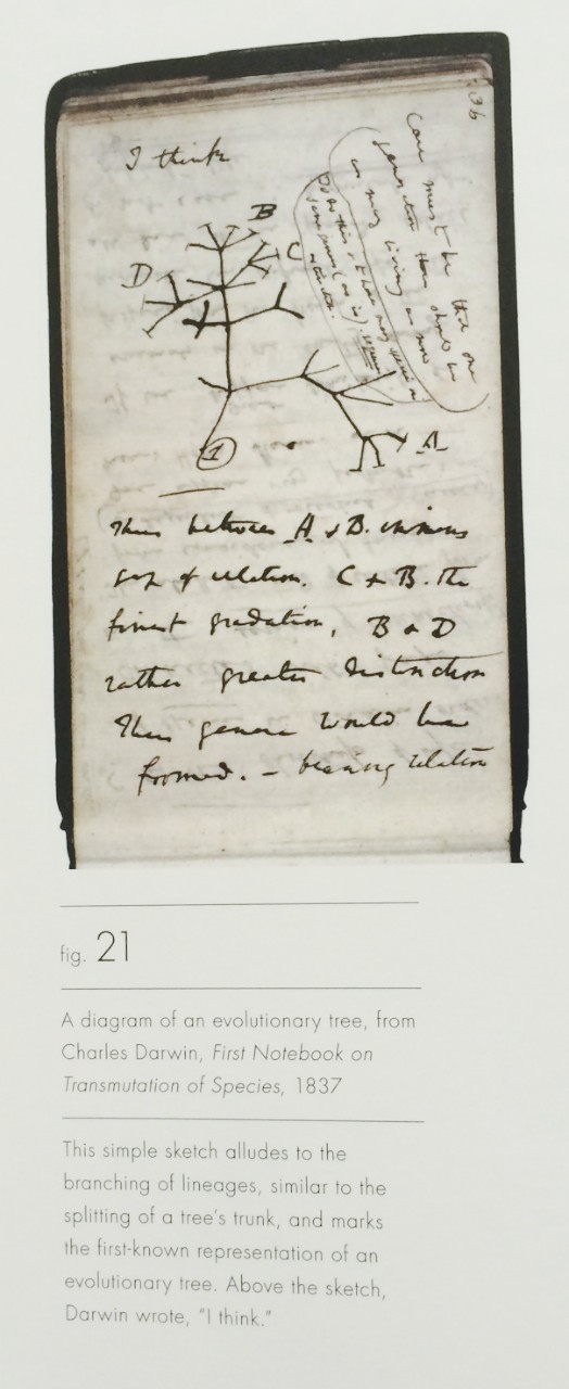
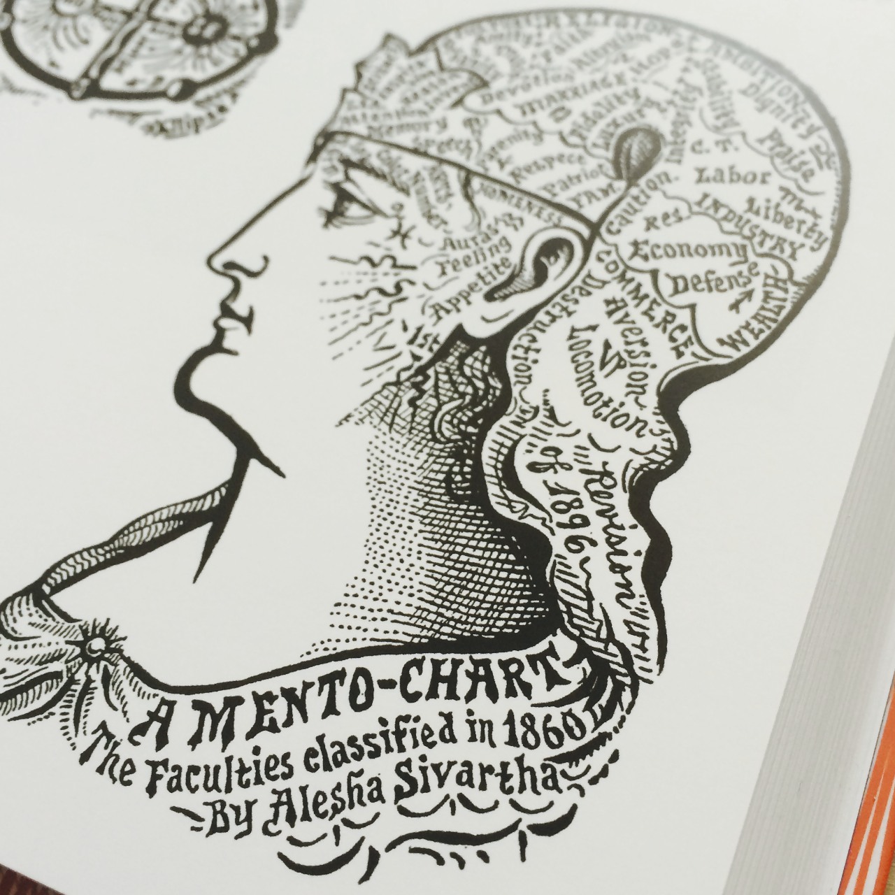
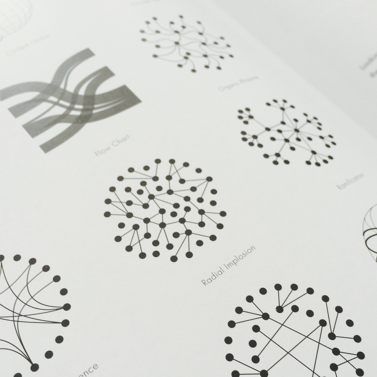
Here's a sampling from Visual Complexity
Here's a sampling from The Book of Trees
Update:
I've spent a little time with these books now, and they are wonderful. However the typography in Visual Complexity troubles me. It's the body copy. It's justified on 2 columns and is set at a nice large size, but the line length, in my opinion, is too short. It causes lots of hyphenation and makes the gaps between words much larger than the 'i' rule. The result means the words appear disconnected, interestingly much like datapoints, but it's less legible.
Don't let this put you off, the book is still a sumptuous collection of fantastic data visualizations and ideas.


