I'm often visiting the Letterform Archive just after they've put on a visit for this or that design team or artist or historian. So I get to see the 'table' that's been put together for them. Sometimes these reflect specific themes or ideas the visitor has requested other times it's more of a 'greatest hits' or simply reflects what the person running the session loves the most.
Last time I was there, the table was a particularly eclectic and fascinating collection of items.
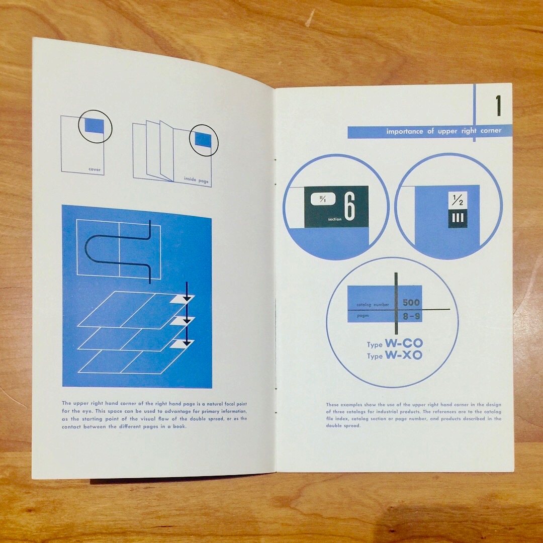
First things to catch my eye were the editions of Design and Paper, and especially this from Ladislav Sutnar about catalogue design.
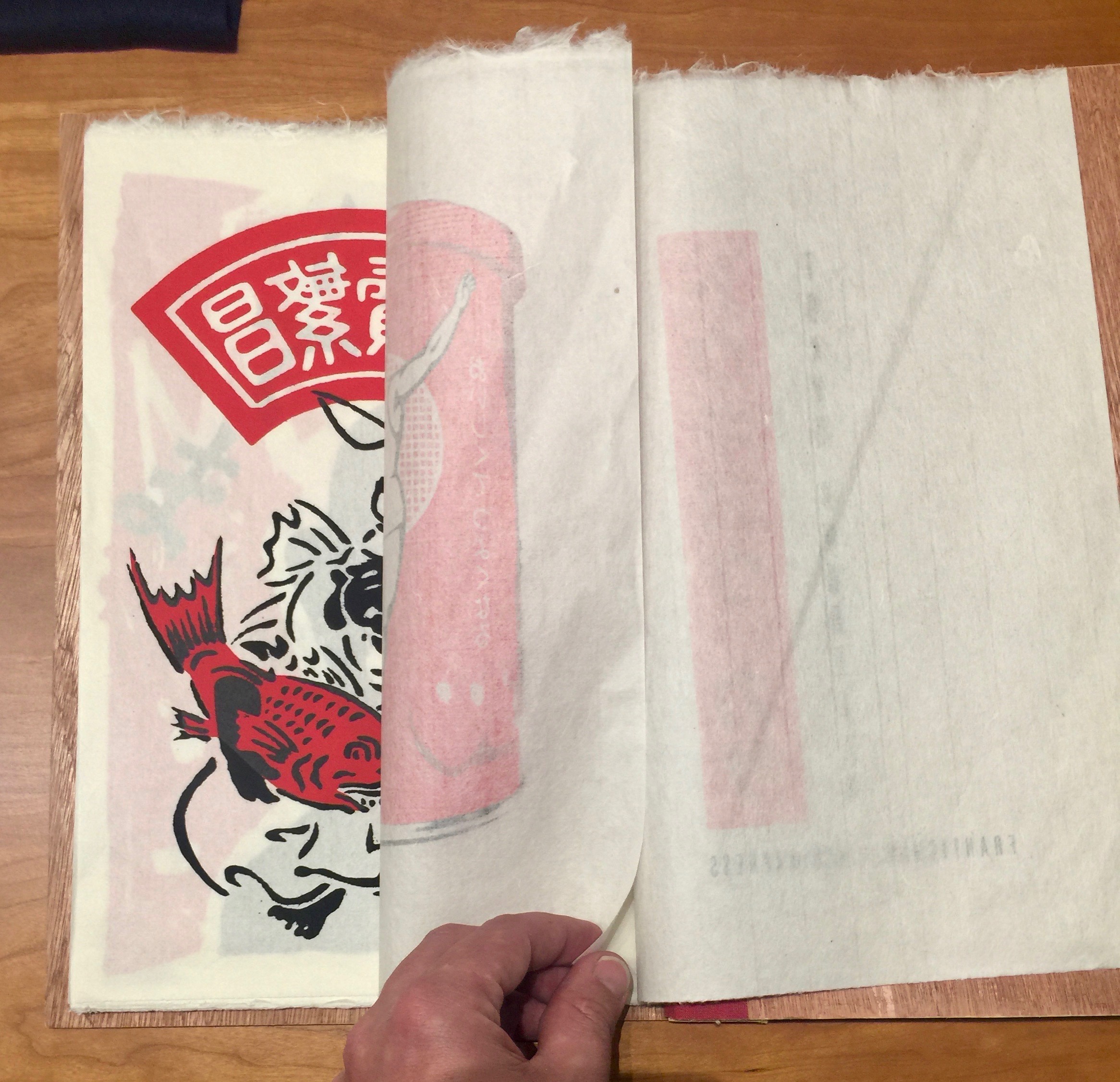
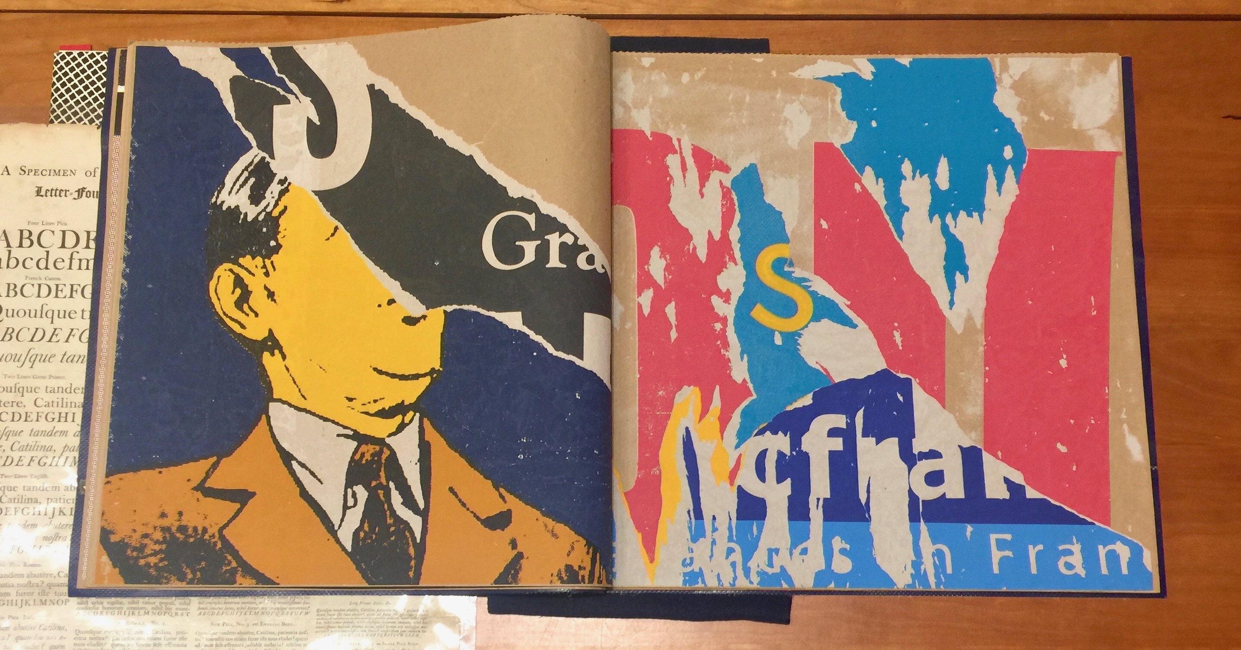
Then I spotted the visual sumptuousness of the city books from Red Fox Press. These beautiful objects are a real feast for the senses. Fantastic use of materials, combined with glorious screen printed colour make them true objects of desire. The three shown are Tokyo, Berlin and Paris and each uses a different visual vernacular from the cities as the creative approach. The Berlin book is from 2014/15 and is printed on Korean cattle feed bags by the design pair Franticham (FRANCIS VAN MAELE & ANTIC-HAM).
As I continued to make my way around the table I started to see more and more combinatorial design artefacts, including Queneau's Cent mille milliards de poèmes and 'the book that's could be made'— Jonathan Safran Foer's Tree of Codes as well as many other experimental formats. There were a few personal favourites, like the semaphore cover of Typografische Monatsblätter and this beautiful typographic deconstruction on trace.
But these incredible re-imaginings of classic fairy tales by Warja Lavater from Adrien Maeght were a wonderful surprise. Each one reworks a fairy tale through illustration, half visualisation, half illustrative storytelling. These first 2 pics below are from Little Red Riding Hood and even include a legend - wonderful idea and there's a box set to boot!
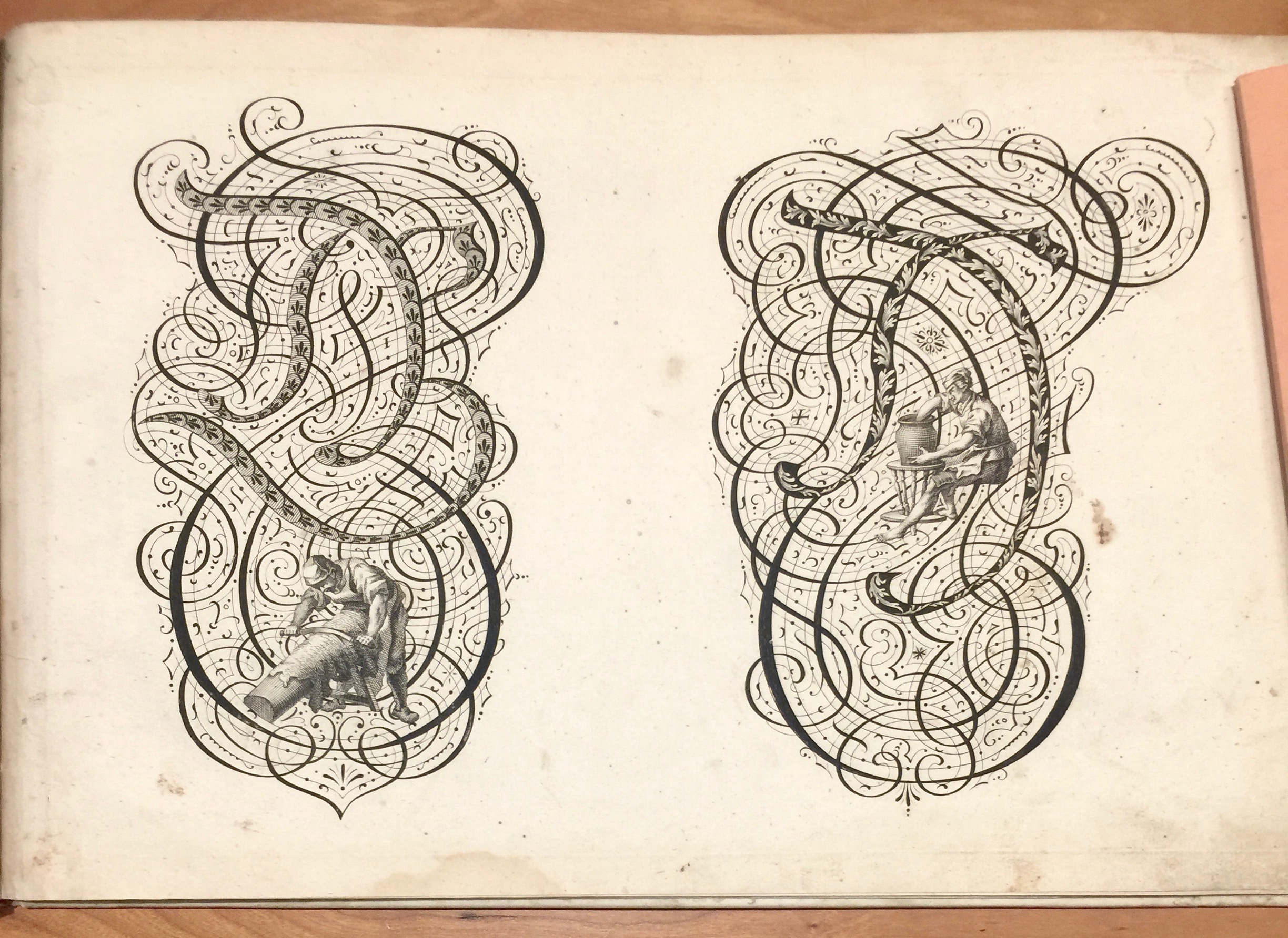
Wonderful way to spend the end of the day. And of course there were plenty of historical letterforms out too.
