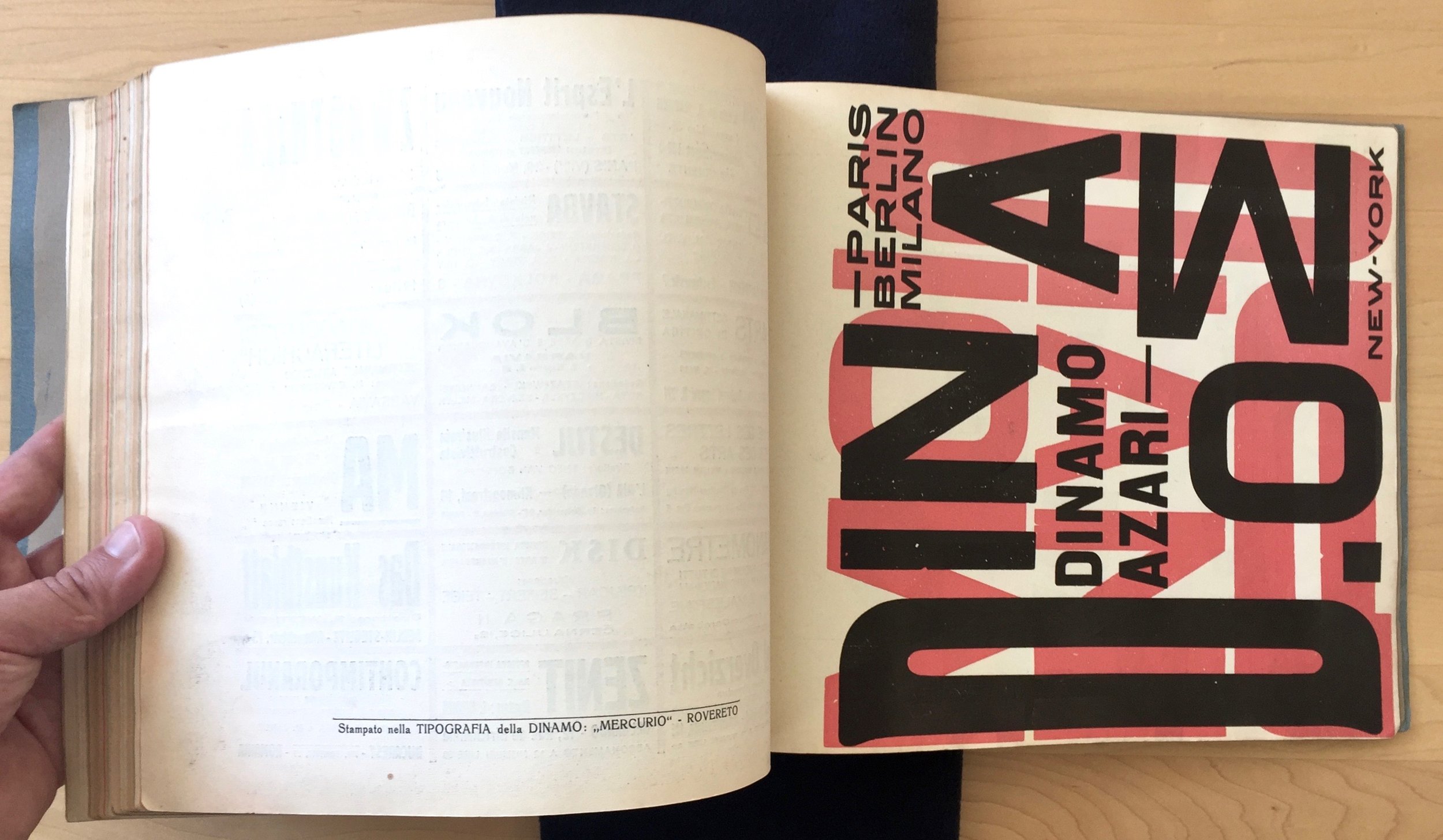
It's been way too long since I had something to post about, so when this arrived this week I was doubly happy. Some time ago I backed the kickstarter campaign to create a new facsimile of Depero's 1927 'bolted book'.
I've been a longtime fan of the book after seeing it at a fantastic Depero exhibition at the Estorick Gallery in London. The book is pretty rare and due to the wonderful physicality of it, it really needs to be seen and held in person to appreciate it. So when Designers and Books launched a campaign to create a new facsimile of it I couldn't resist it.
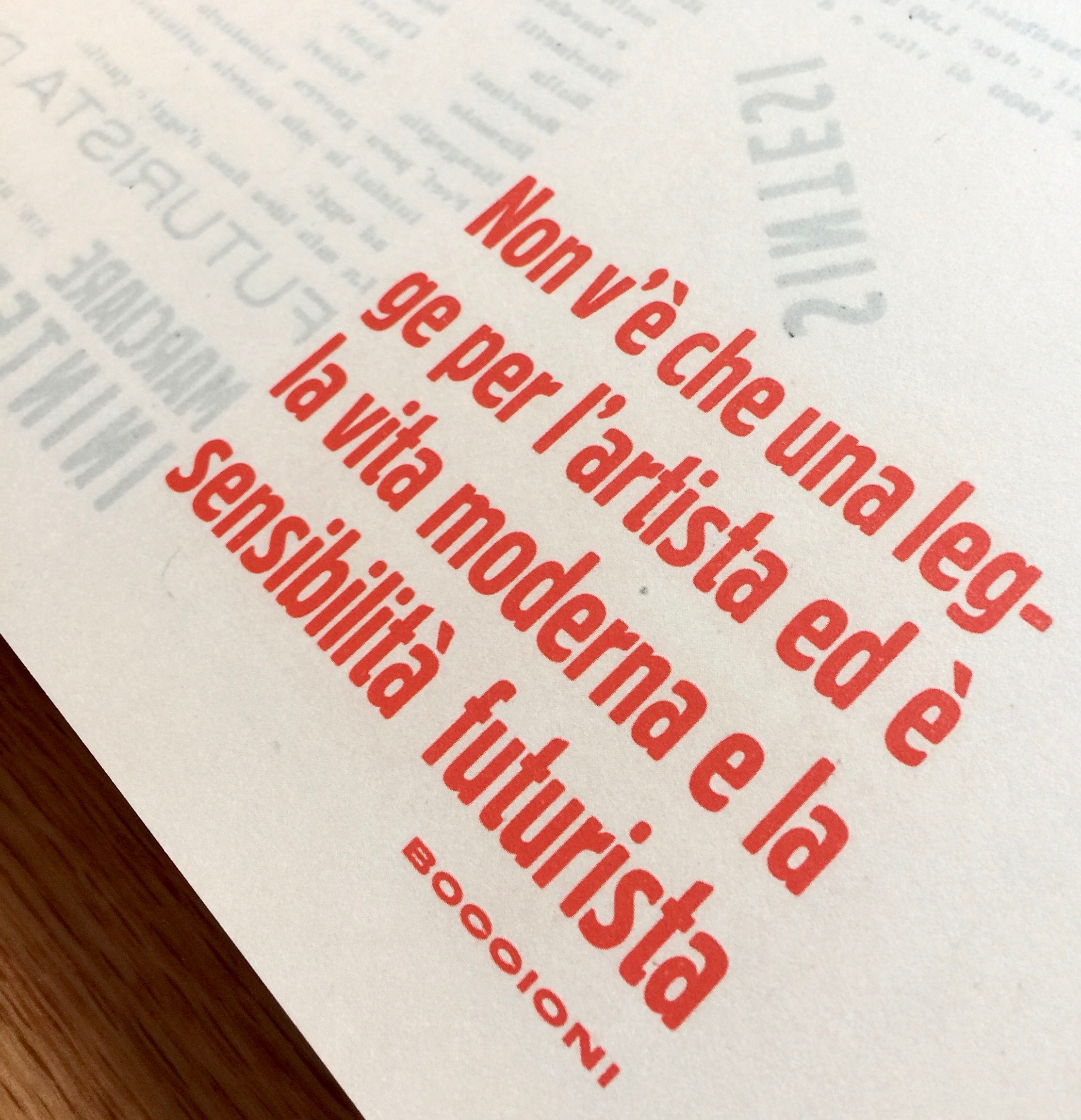
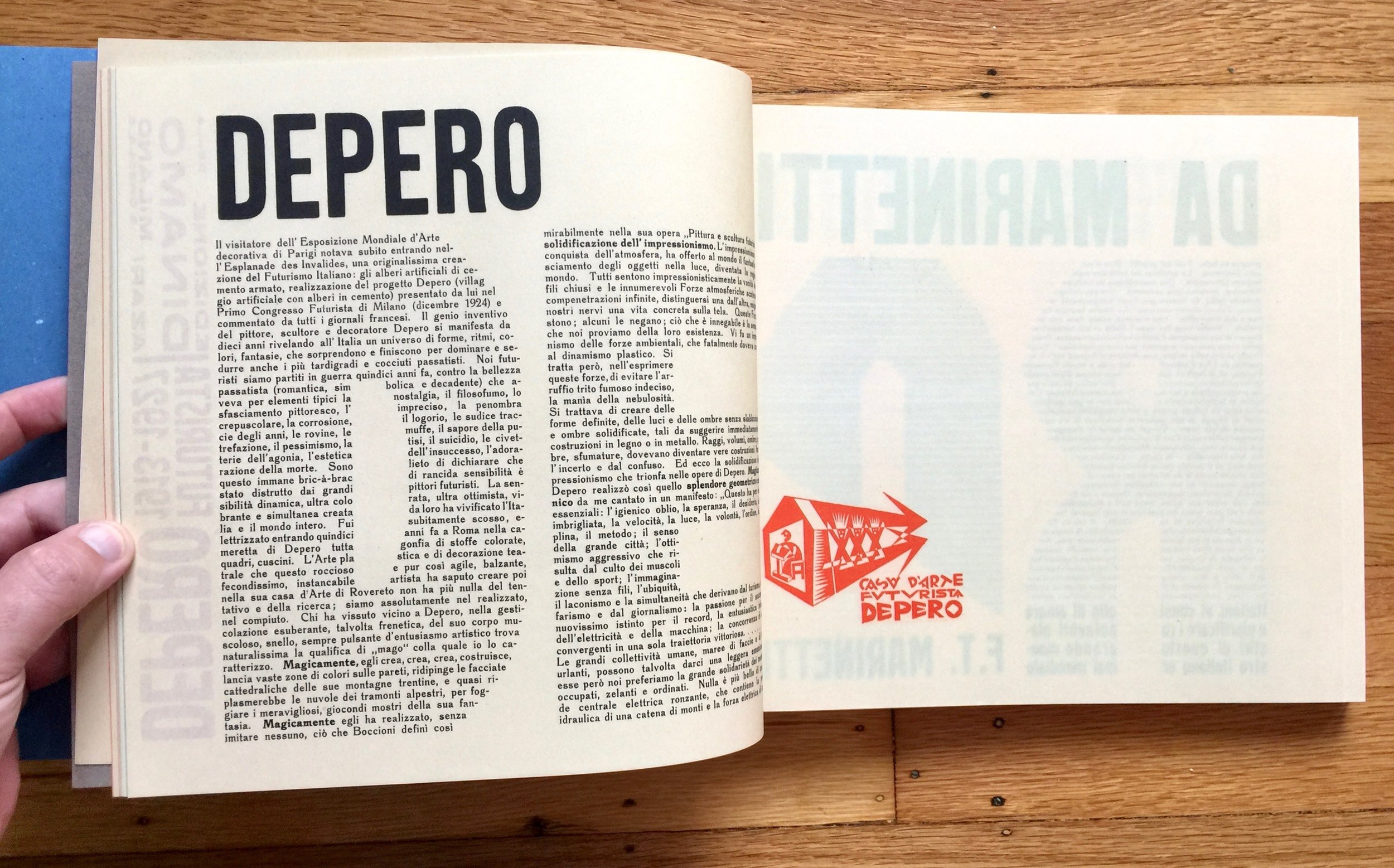
They've done a fantastic job, right down to the massive bolts that bind it. The thing about a facsimile rather than, say a new edition, is that it attempts to reproduce the physical nature of an existing item. That means it mimics things that are the result of age, or the print process, or the feel of the paper stock. To do this often involves a little smoke and mirrors and a lot of design sleight of hand. For instance, in the original the heavy ink originally used shows through to the reverse of the page (this maybe through ageing). In the facsimile they reproduce this by printing the ghost on to the back side of the page.
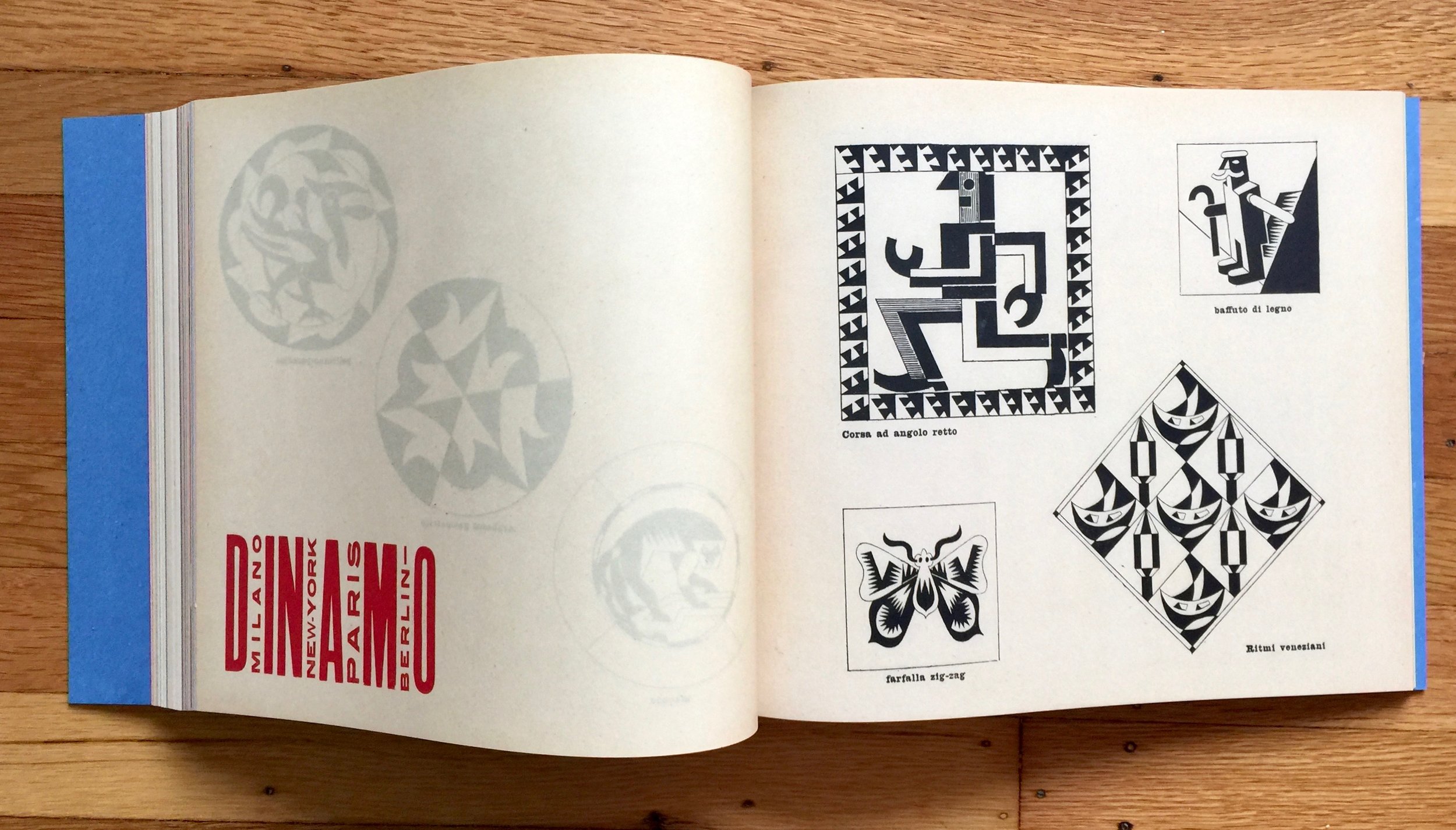
Another great trick employed is with the stock. The original uses a range of stock from shiny to coloured and heavily textured paper. In the reproduction they recreate the different stock by using similar feeling paper but print the colour and visual patina, even the foxing around the edges.
It's a great exercise in attention to detail and clever workarounds, much better than seeing pictures of it in a glossy art book. Here are few images of the facsimile:
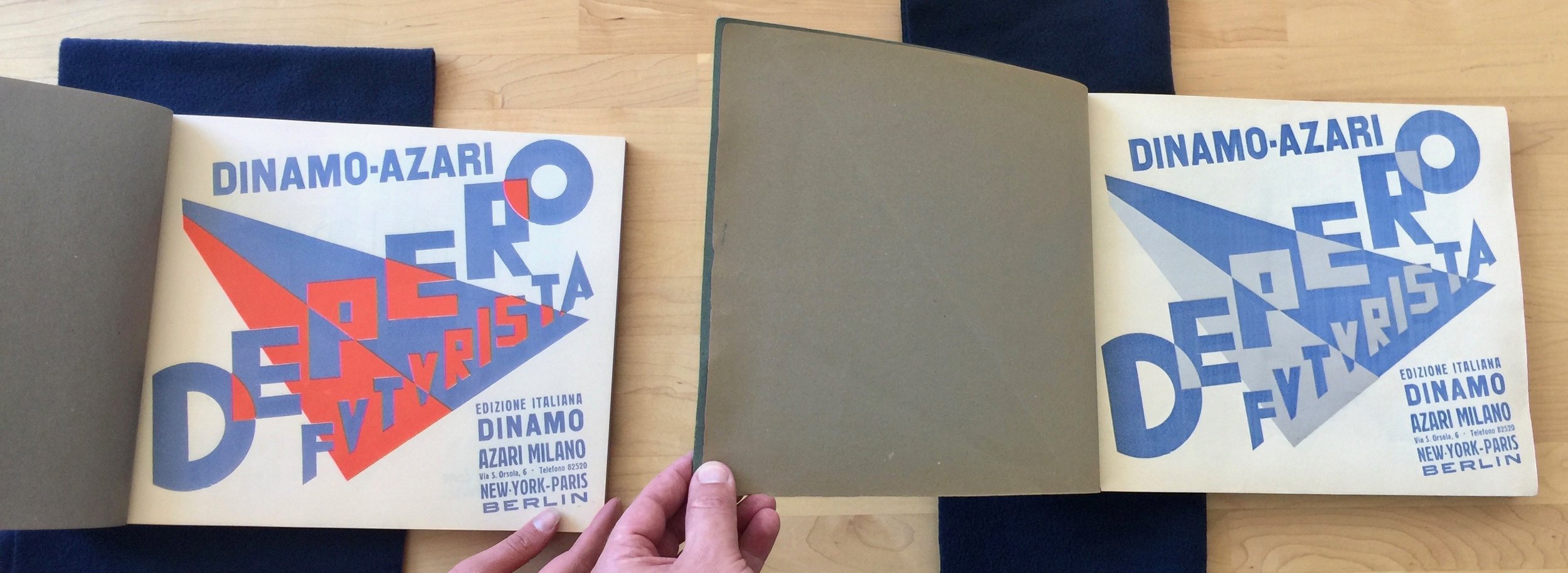
The interesting thing is that it's a facsimile of a specific copy (No. 843), so when I compared it to the one at Letterform Archive (No. 409) you can see some marked differences. The cover seems very different, the board's colour appears green/grey (and looks like this isn't just ageing). Also the orange/red ink is a lot deeper in the original Letterform Archive has - although when you look at the bolted book website and the shots of their original, it seems to have varying depths to the orange/red. There are also variants in the coloured paper stock used for different pages and even which colour ink was used. Check out the side by sides below, facsimile on the left, Letterform Archive's original copy on right:
If you feel like owning your very own copy here's the link http://www.boltedbook.com/
They've also done a great job on the Reader's Guide.
I did think twice about posting this today. The link between the futurists and fascism is well known, and after the horrors seen this weekend in Charlottesville it feels a bit weird to wax lyrically about anything that may have come from a fascist movement. However, it's still a great piece of design and although I still hold to the truism that 'the only good fascist is a dead one' - I can't help but love Depero's work.


