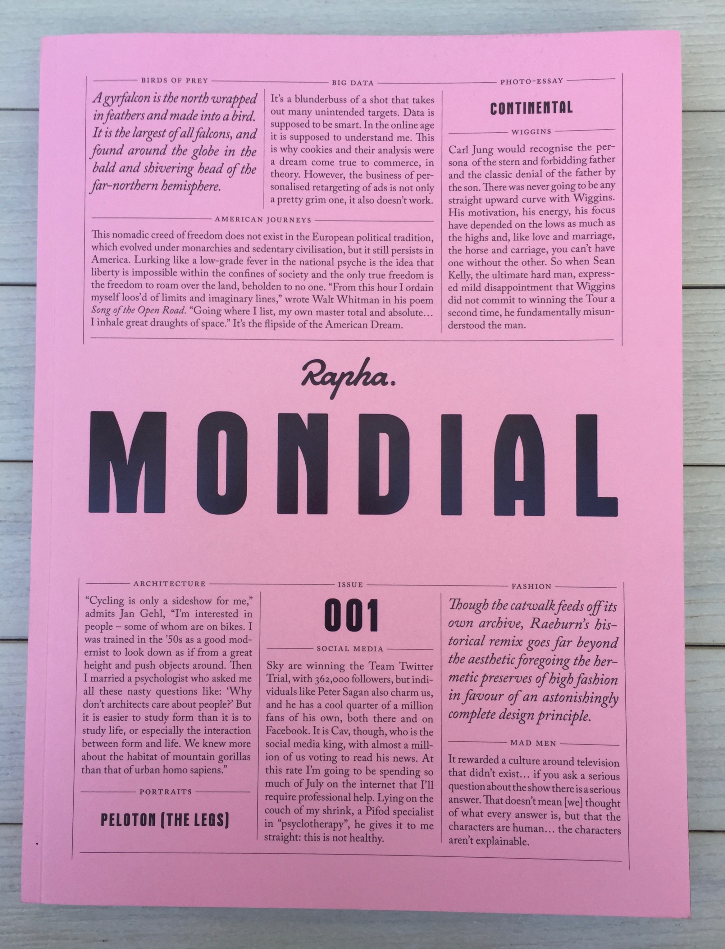
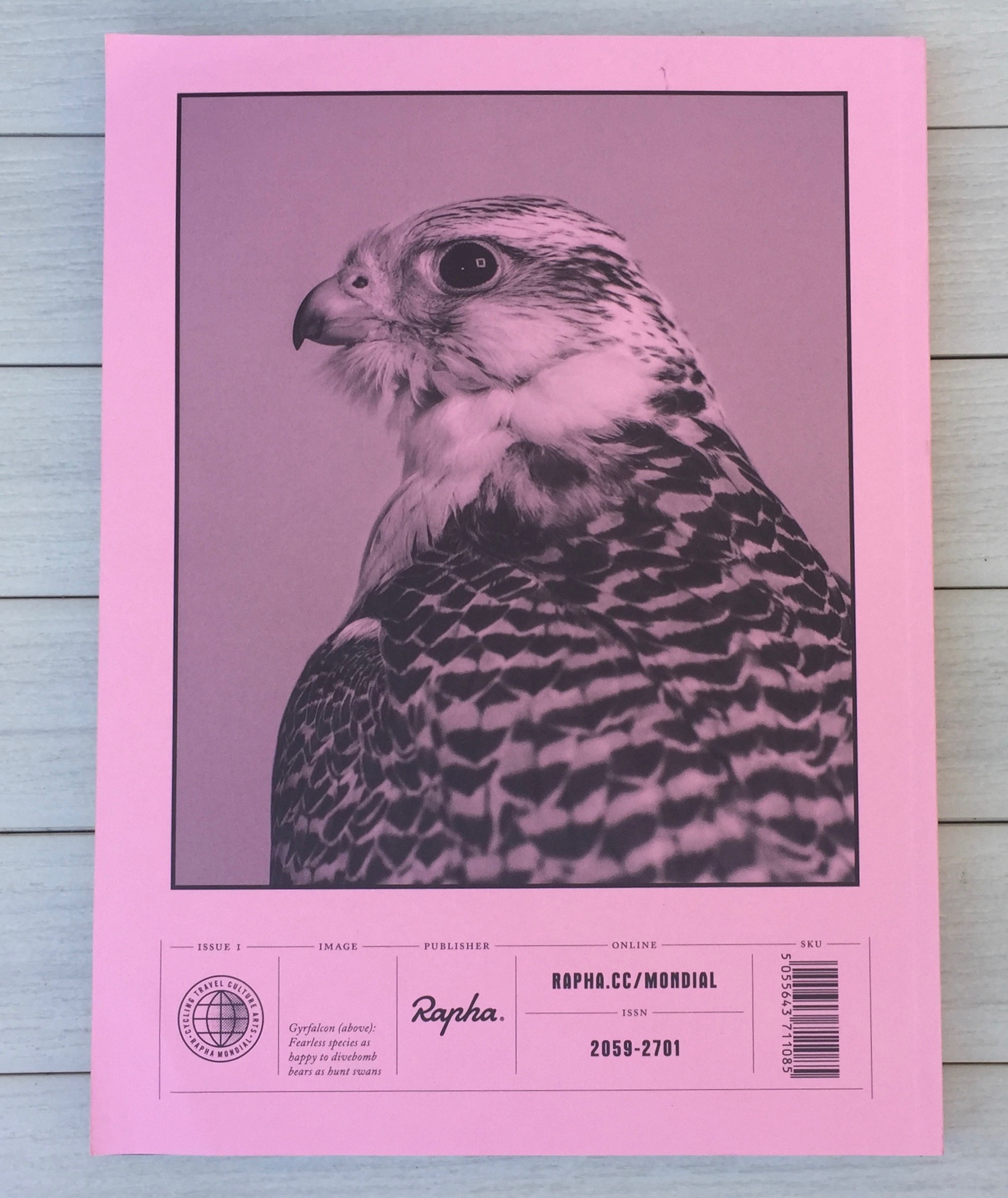
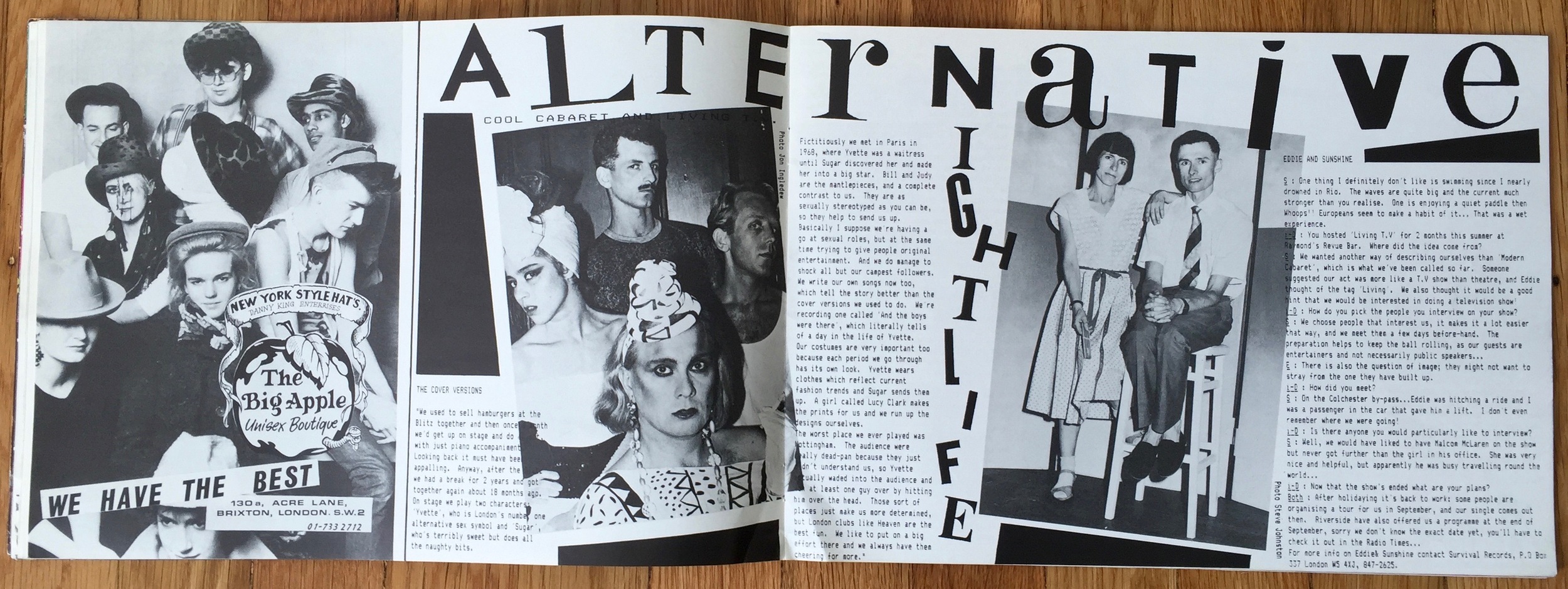
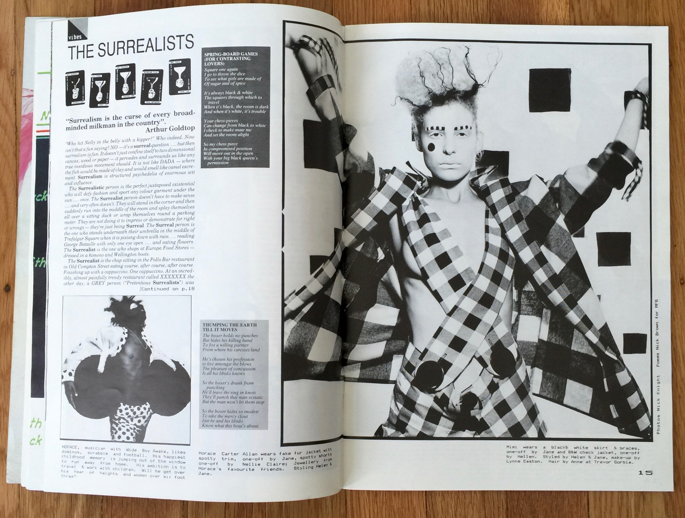
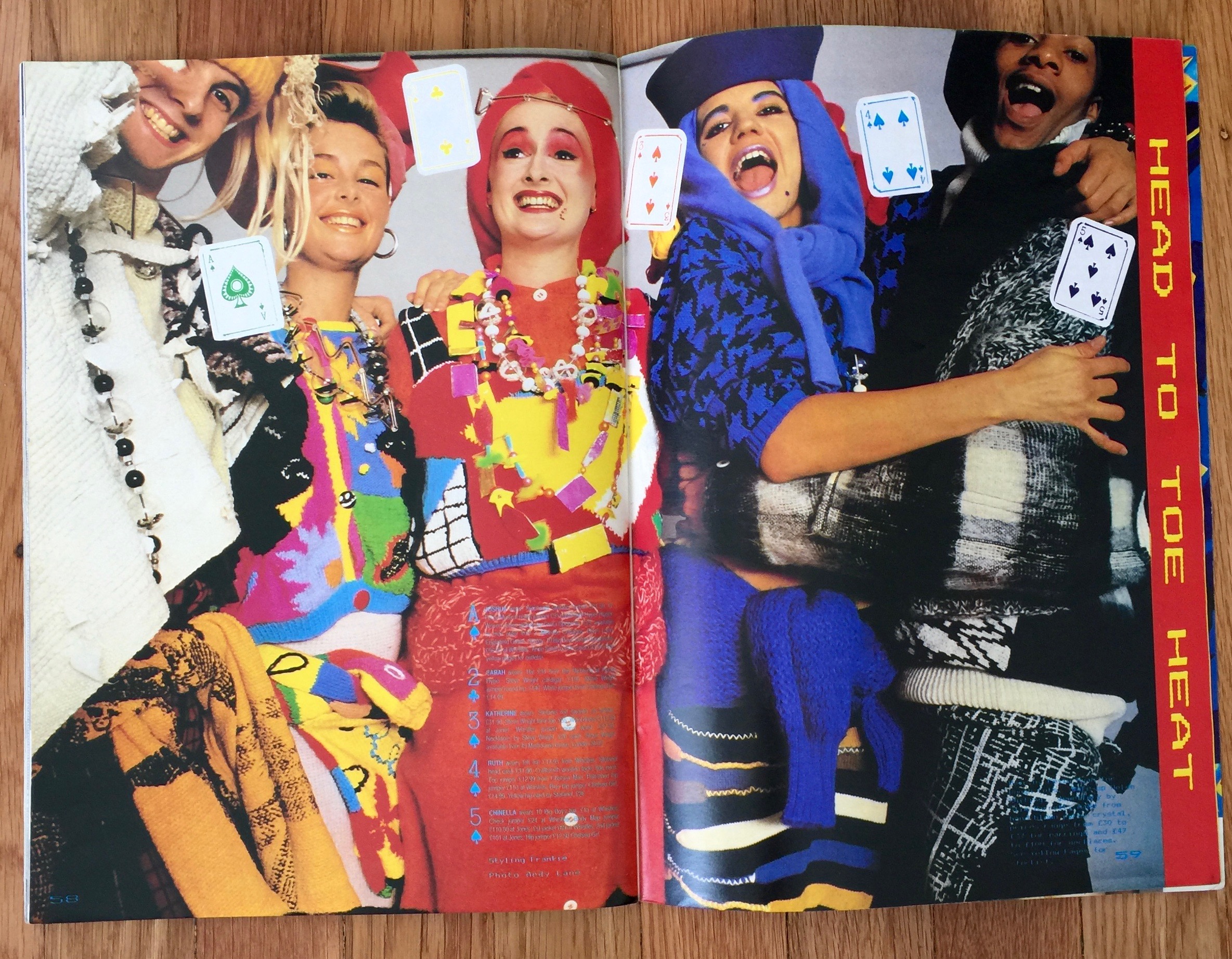
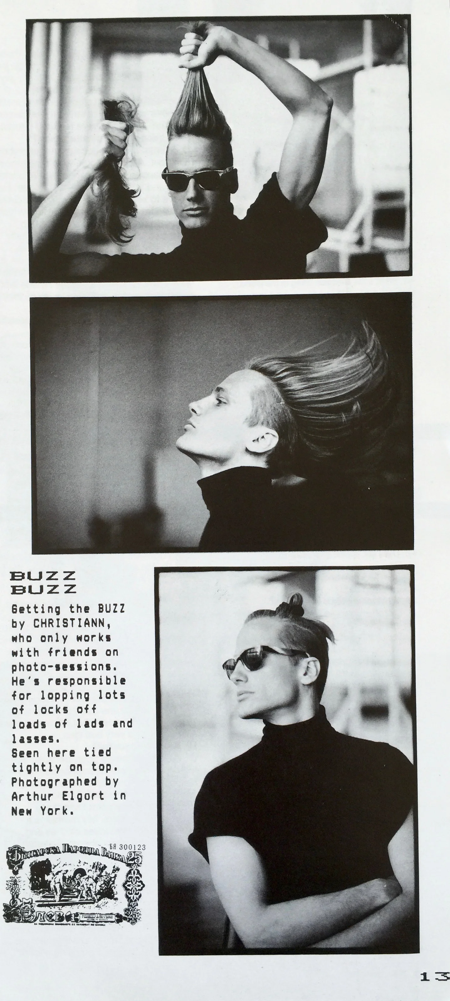
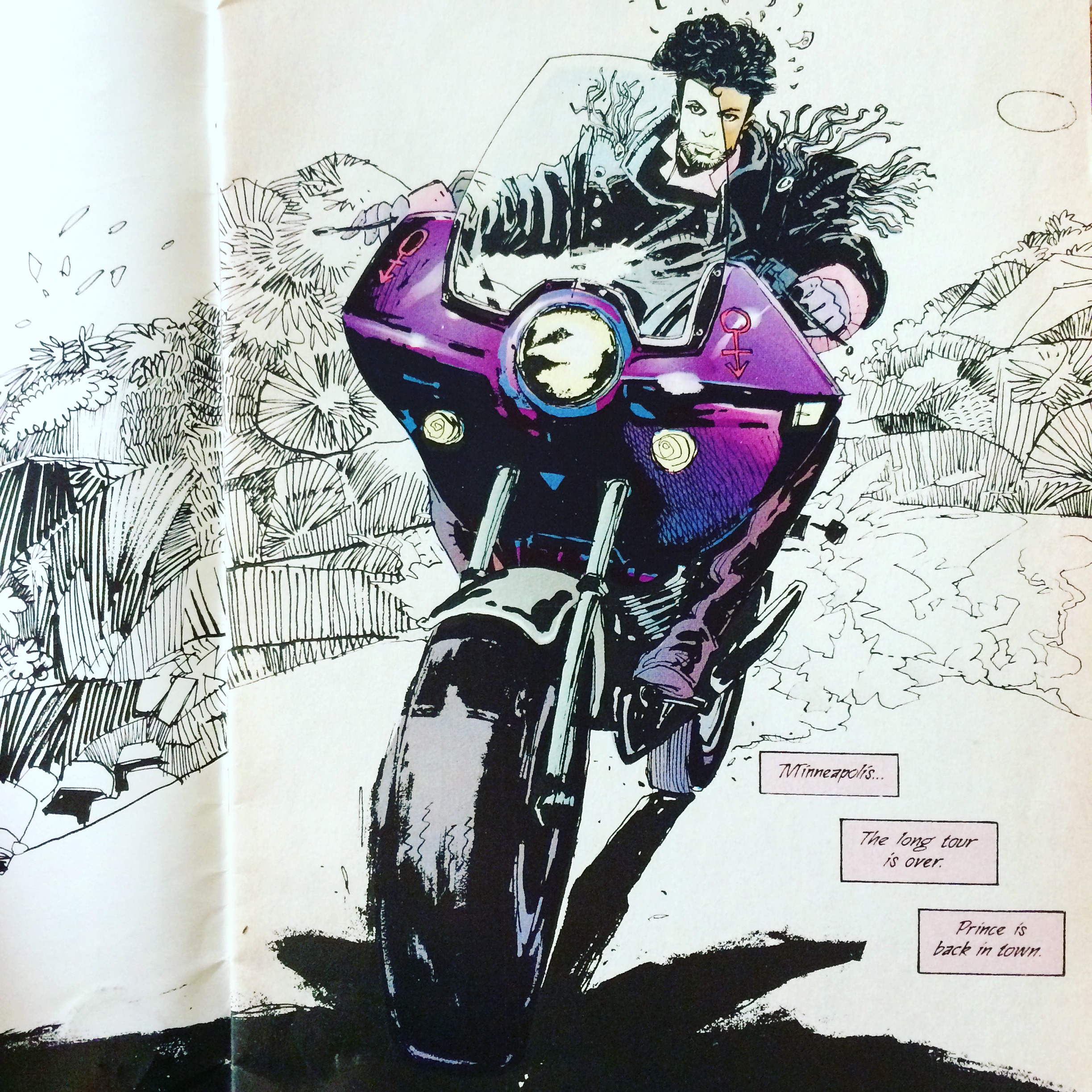
There's something about cycling that seems to brings out the best in graphic designers. I'd seen a few pieces about Mondial magazine from the British cycling brand Rapha on the design blogs, but hadn't seen it in the flesh until I visited their San Francisco store. Rapha has been around since 2004. They launched Mondial in 2015 and it's a bi-annual magazine about cycling, but as they put it, it's...
"A WIDER VIEW OF THE ROAD"
With intelligent articles and interesting asides, it's much much much more than a cyclist's zine.
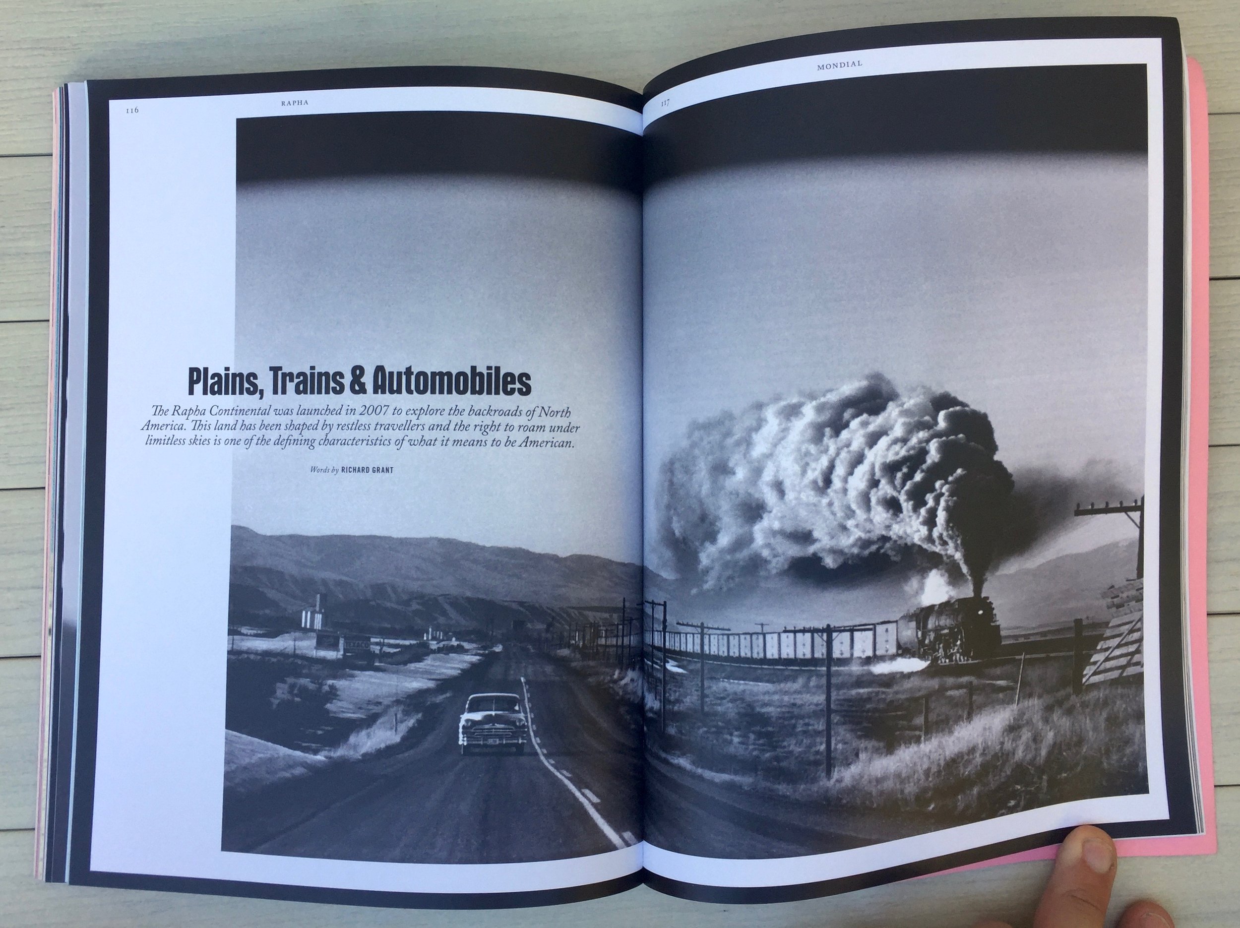
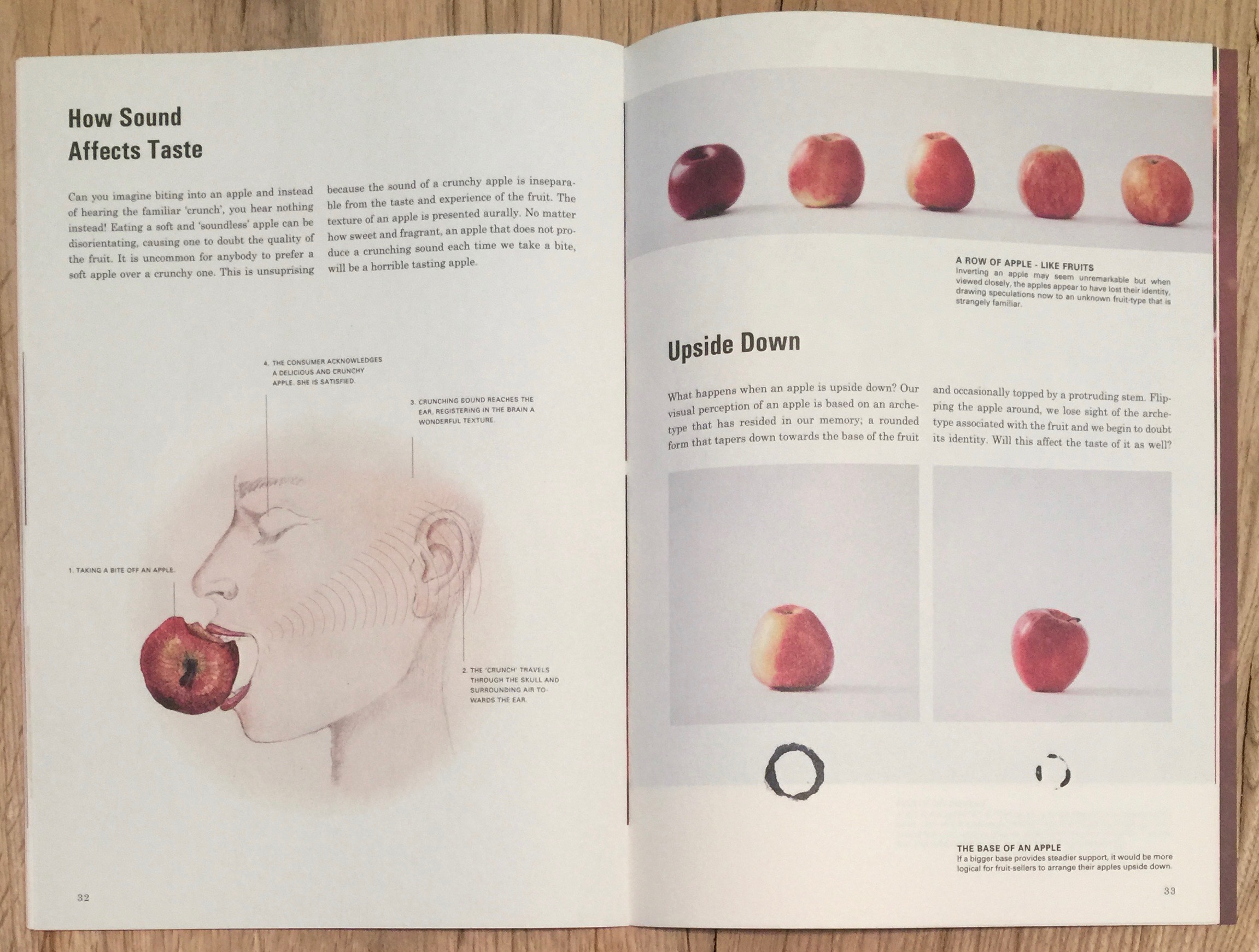
The thing is, Mondial is gorgeous. Which seems appropriate, as Rapha the brand is 100% design driven with incredible attention to detail. For me Mondial is one of the most elegant and beautiful magazines I've seen in a long time. Not only that, it's also brave with it's design and it's editorial. Everything is on the money; stunning typography, beautiful photography, wonderful colour work, lovely stock and of course great writing - it's the full package. When I first picked it up it reminded me of Zembla and Vince Frost's work, but it's more disciplined. The design team of Jack Saunders, Alex Hunting and Ben Brannan have produced a stunning piece of work. They never let the design idea take over, it's always kept it in perfect balance. Stunning.
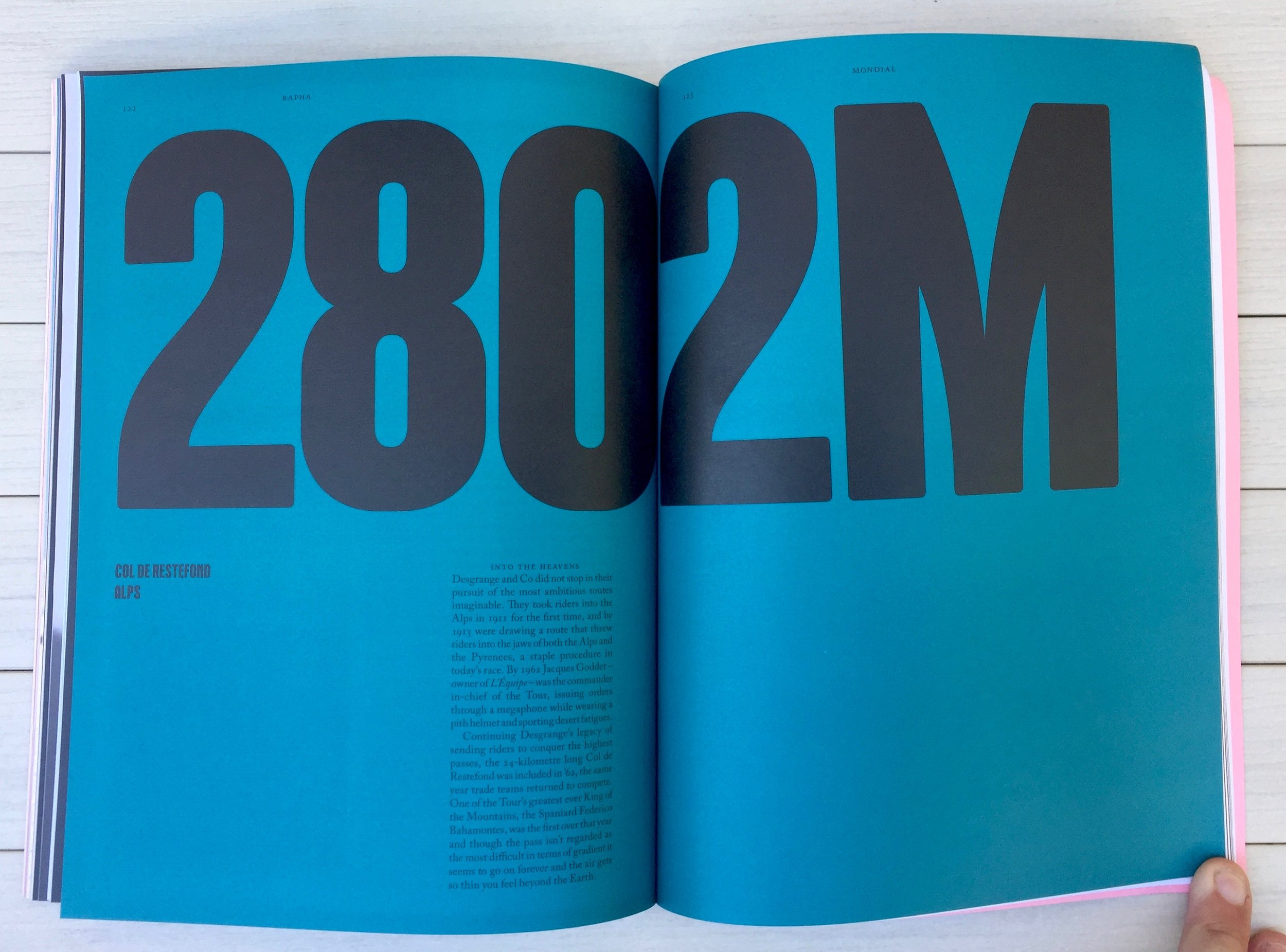
Look at the fun they have with numbers, type and colour:
This is my favourite spread, really shows off their custom font; Mondial by Colophon Foundry. And it's a great piece of typographic layout.
The grid(s) work really well, lending great structure but also plenty of options for negative space. Which they aren't afraid to use. Even the photography reflects this sense of space, focus and room to understand the visual idea. The contents pages alone in a work of art.
All that's left is to flag this wonderful statement about cycling, however I'd suggest switching the word 'cycling' for 'design', as that seems equally appropriate.
Great work.
Grab a copy from their online shop here: rapha.cc/Mondial


